Bioflow

Making medical lab results clear and actionable

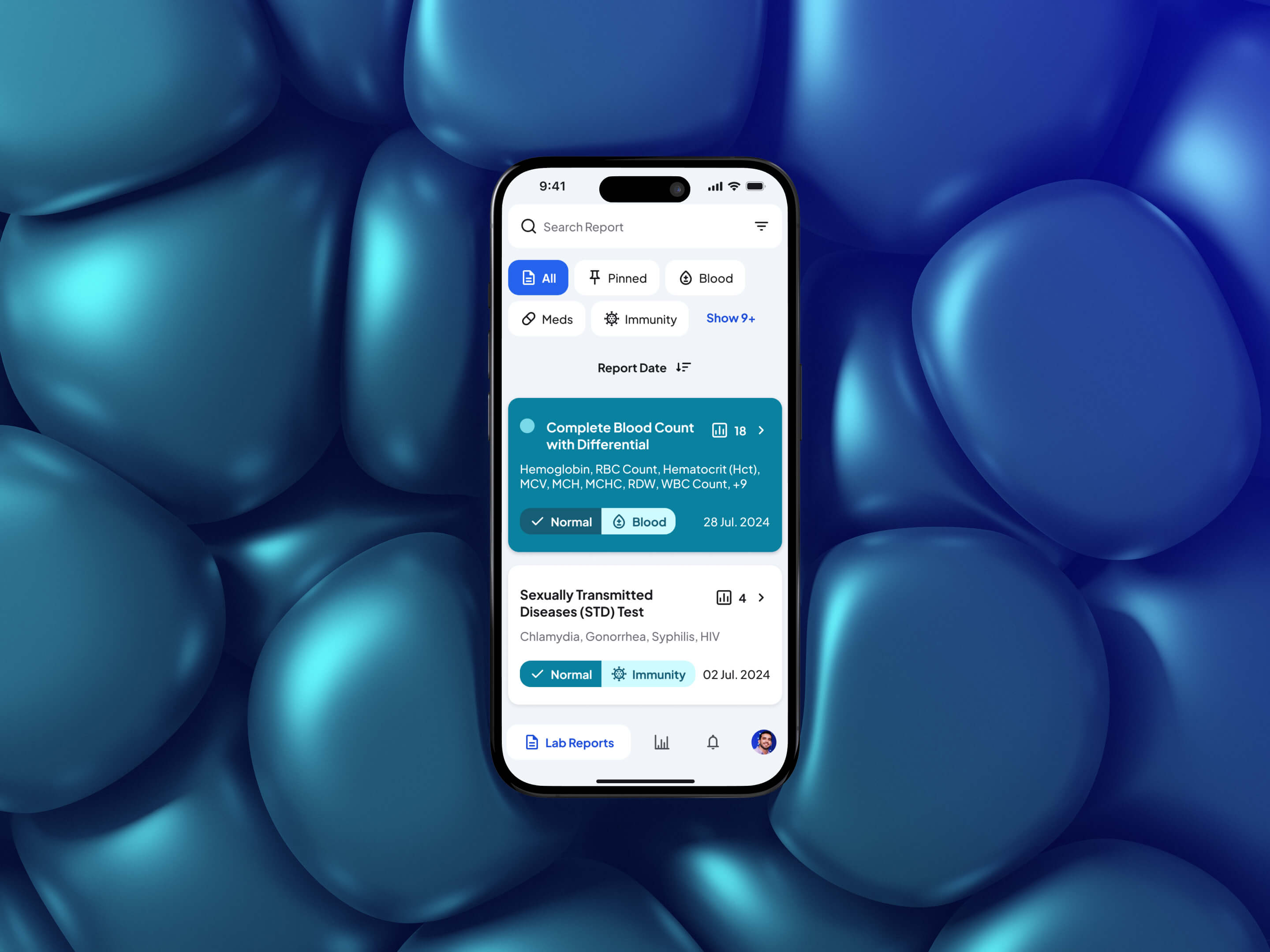
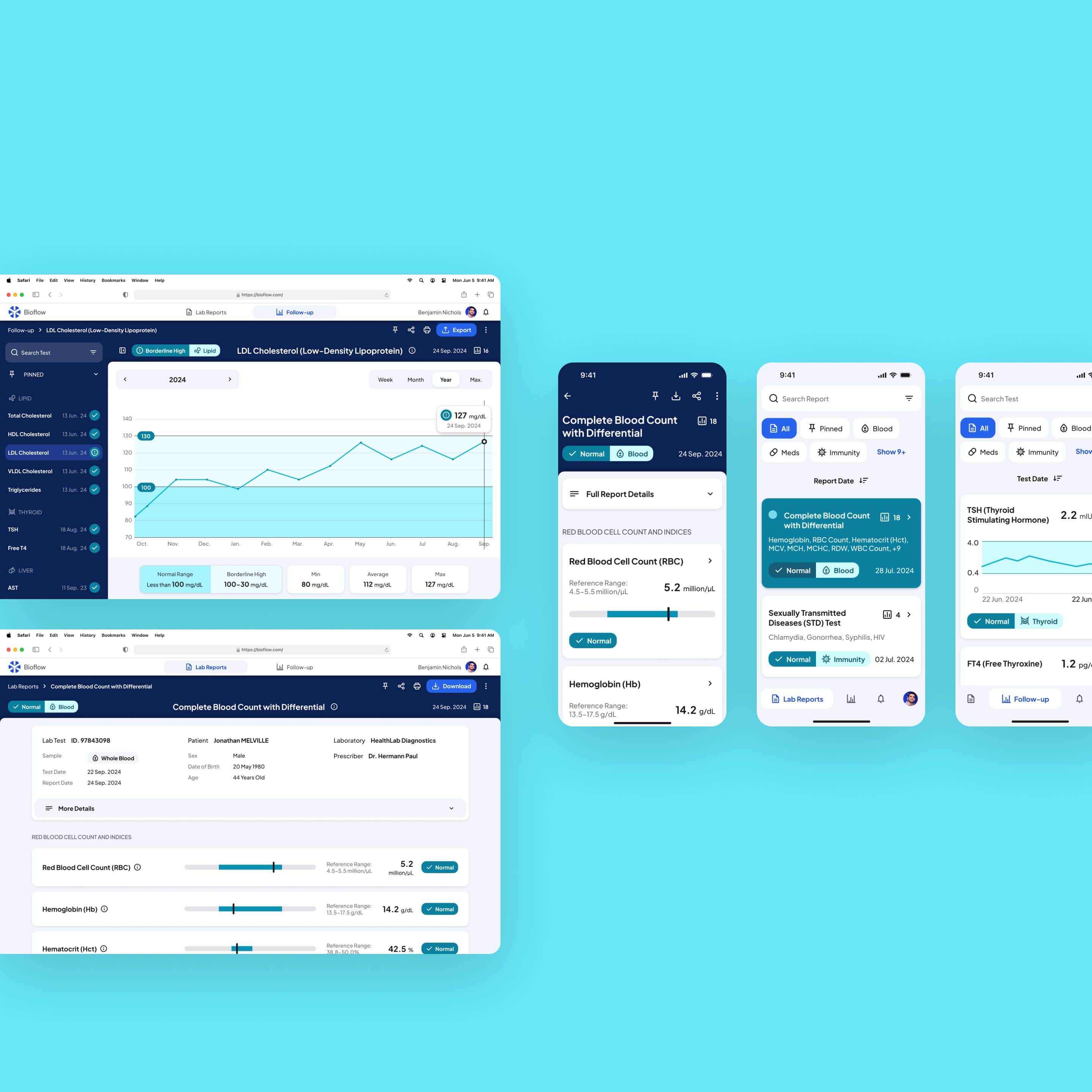
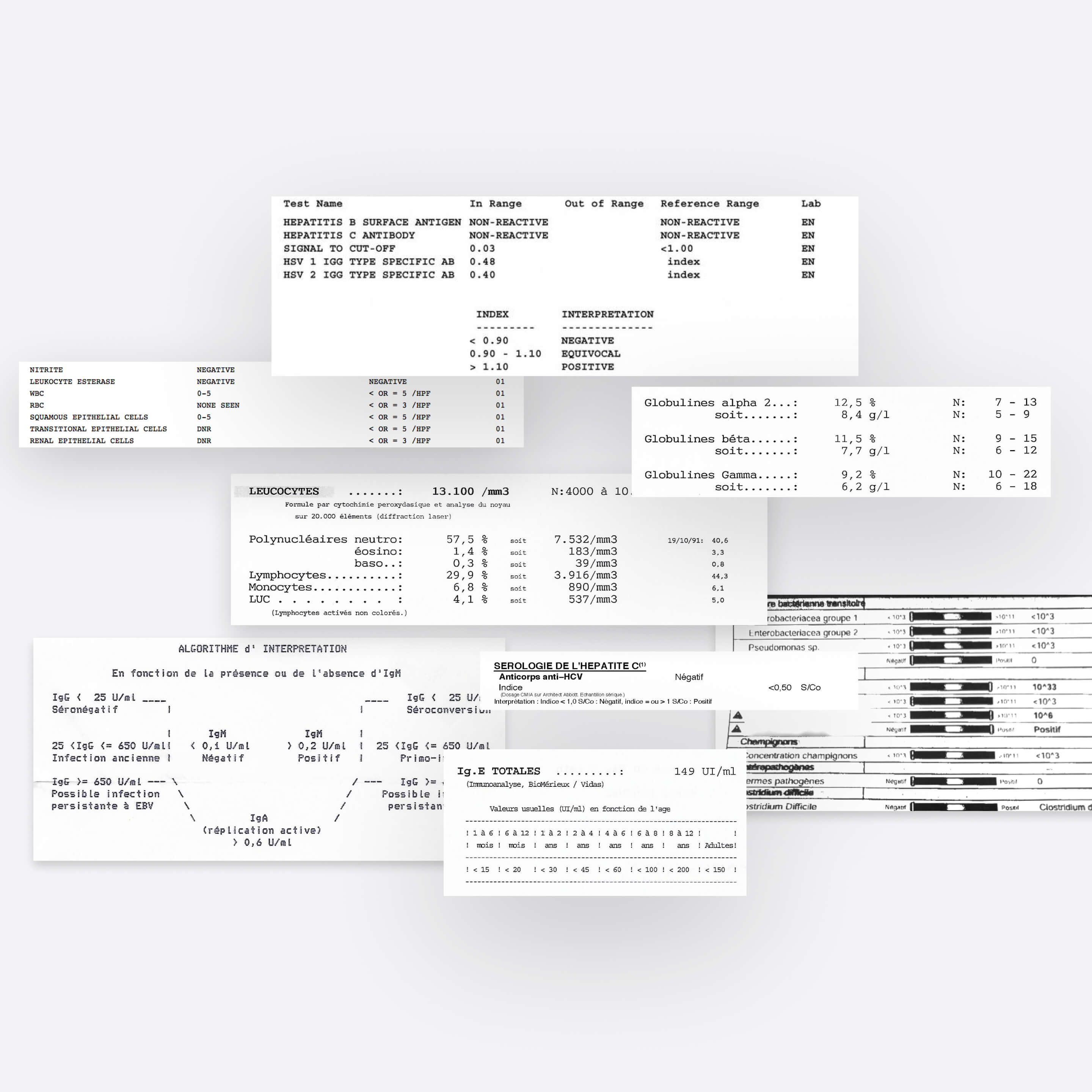
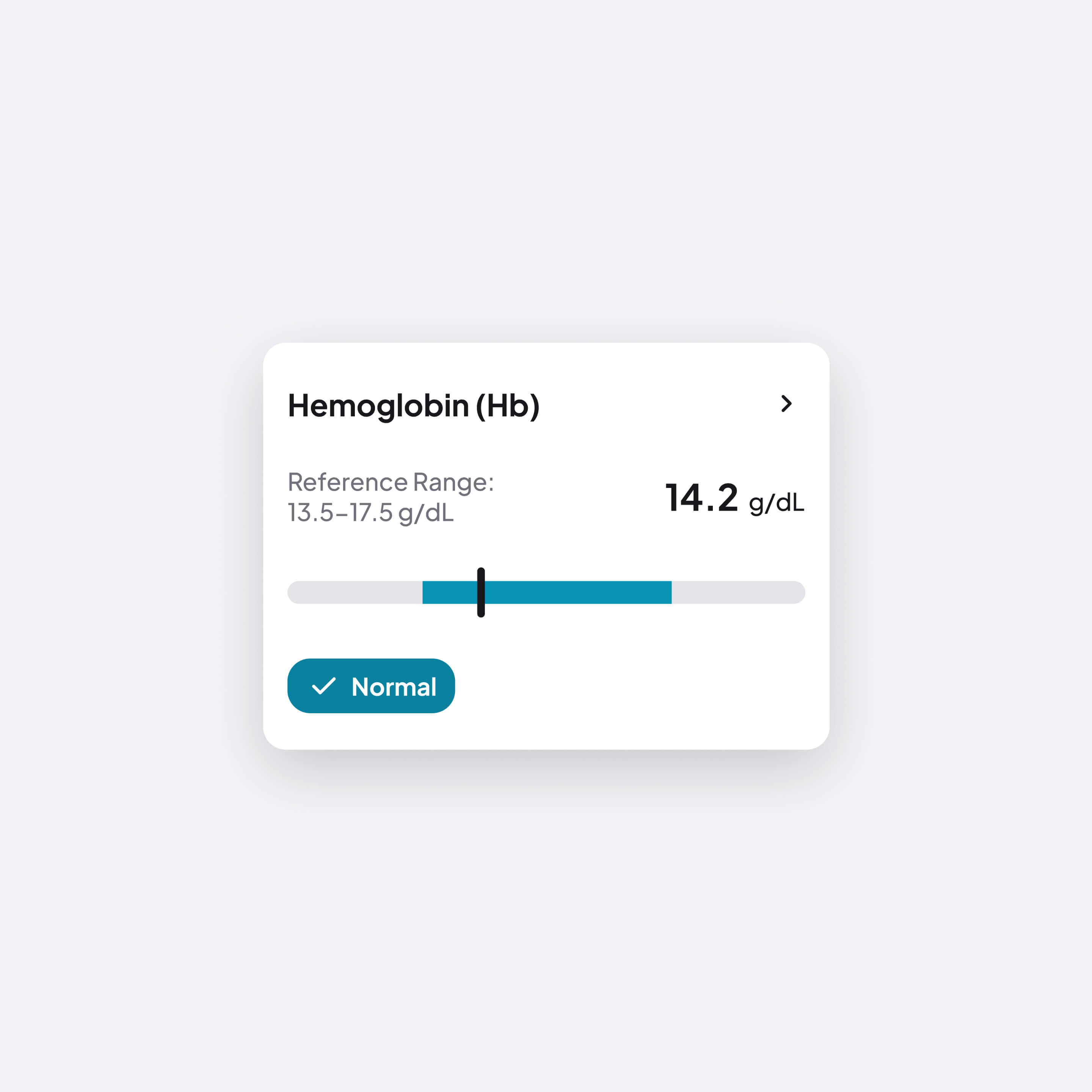
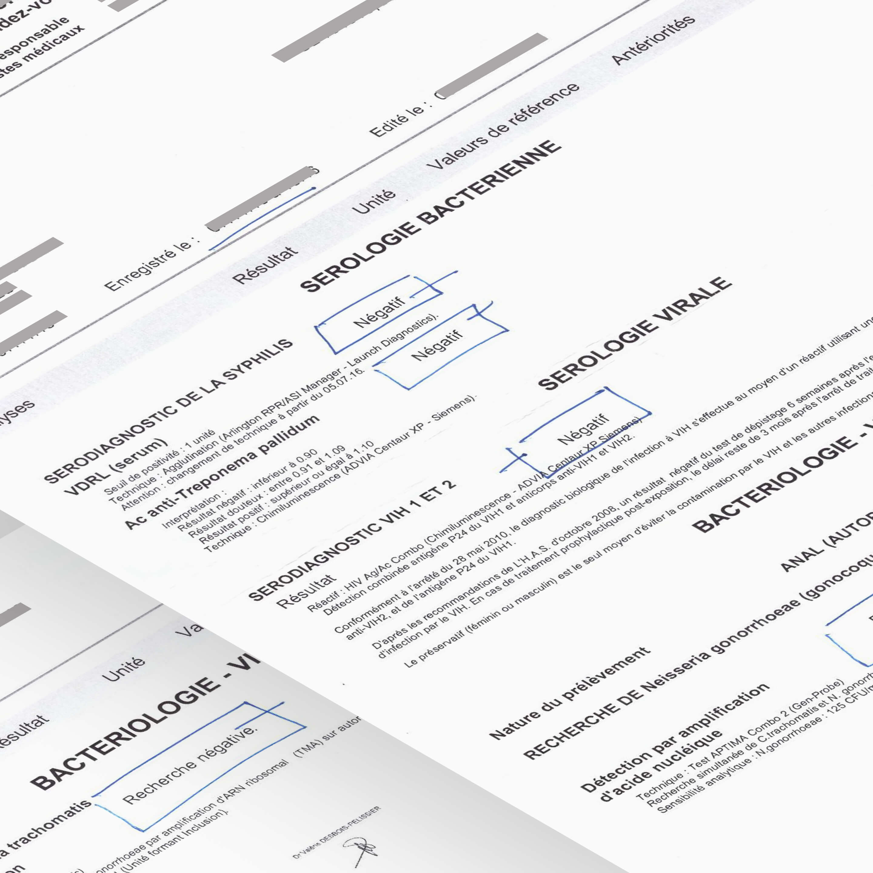
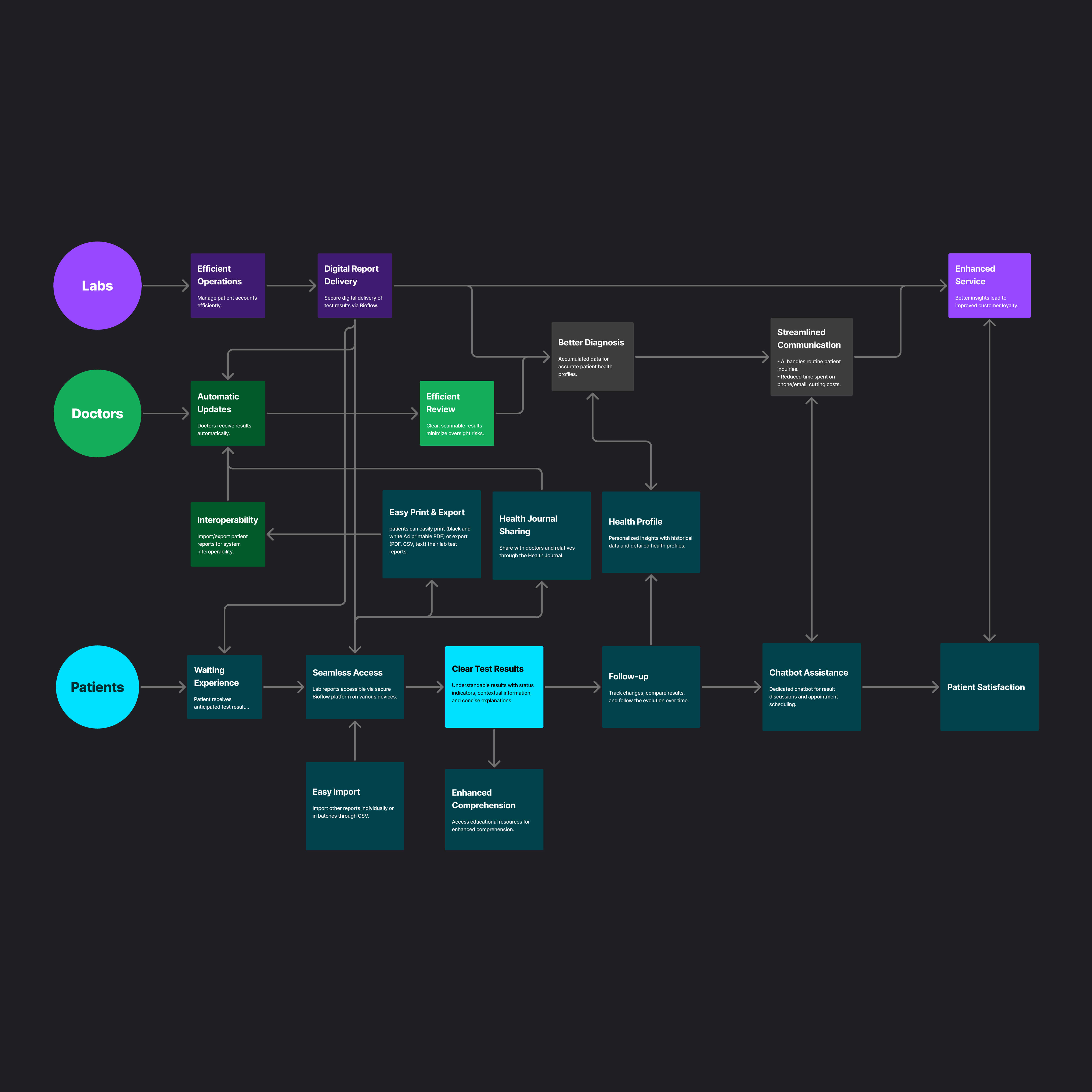
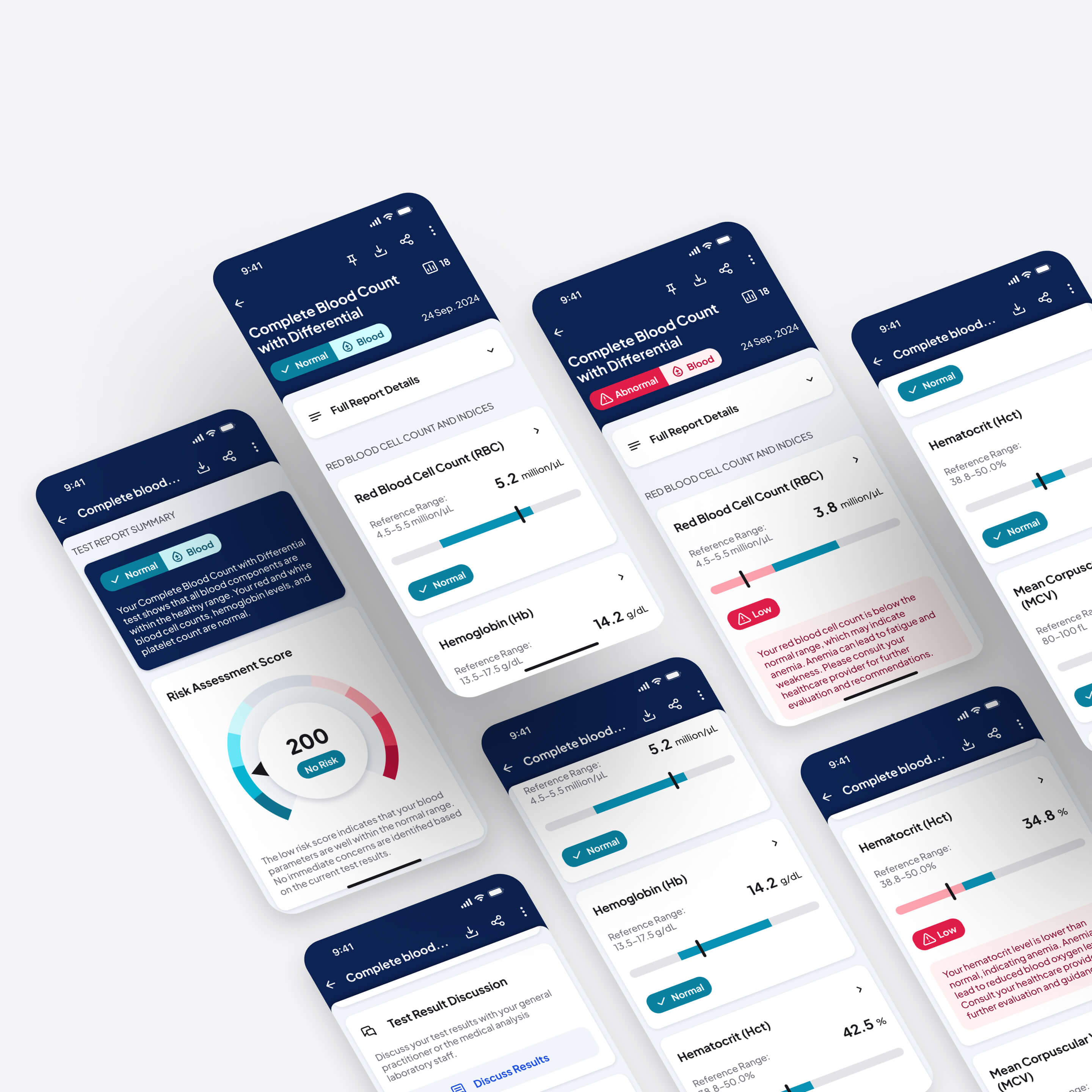
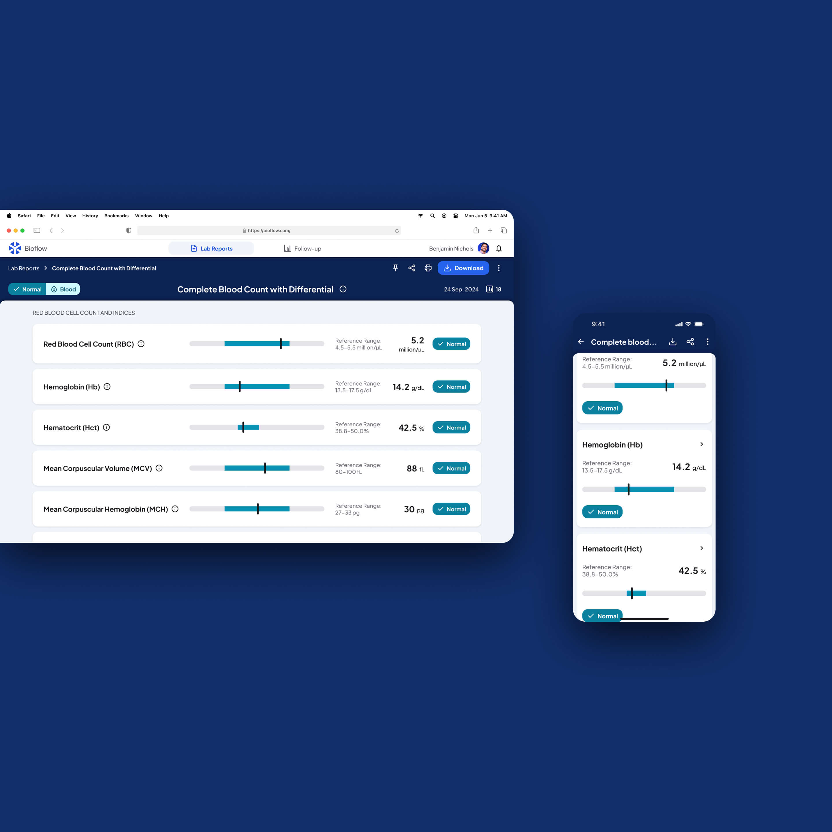
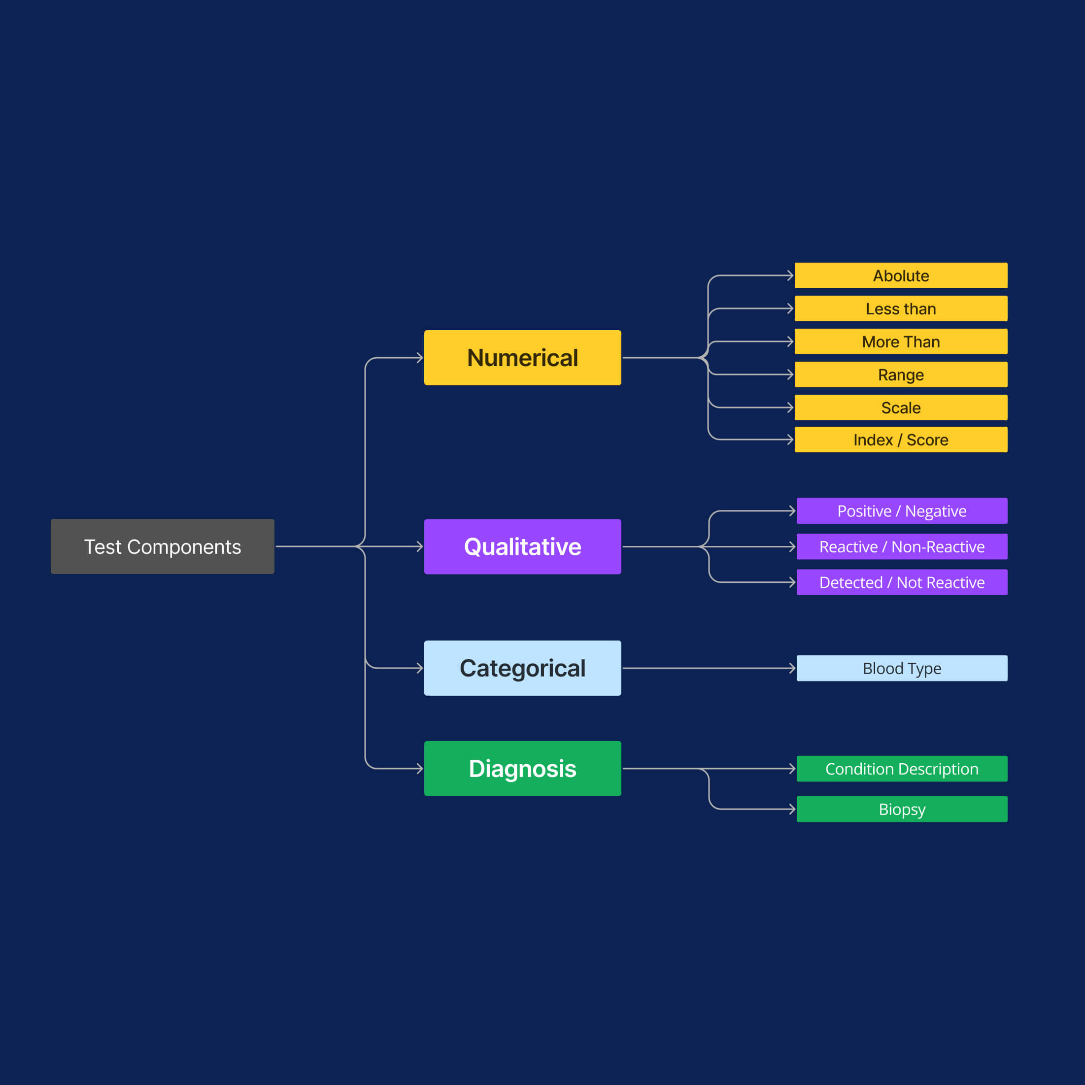
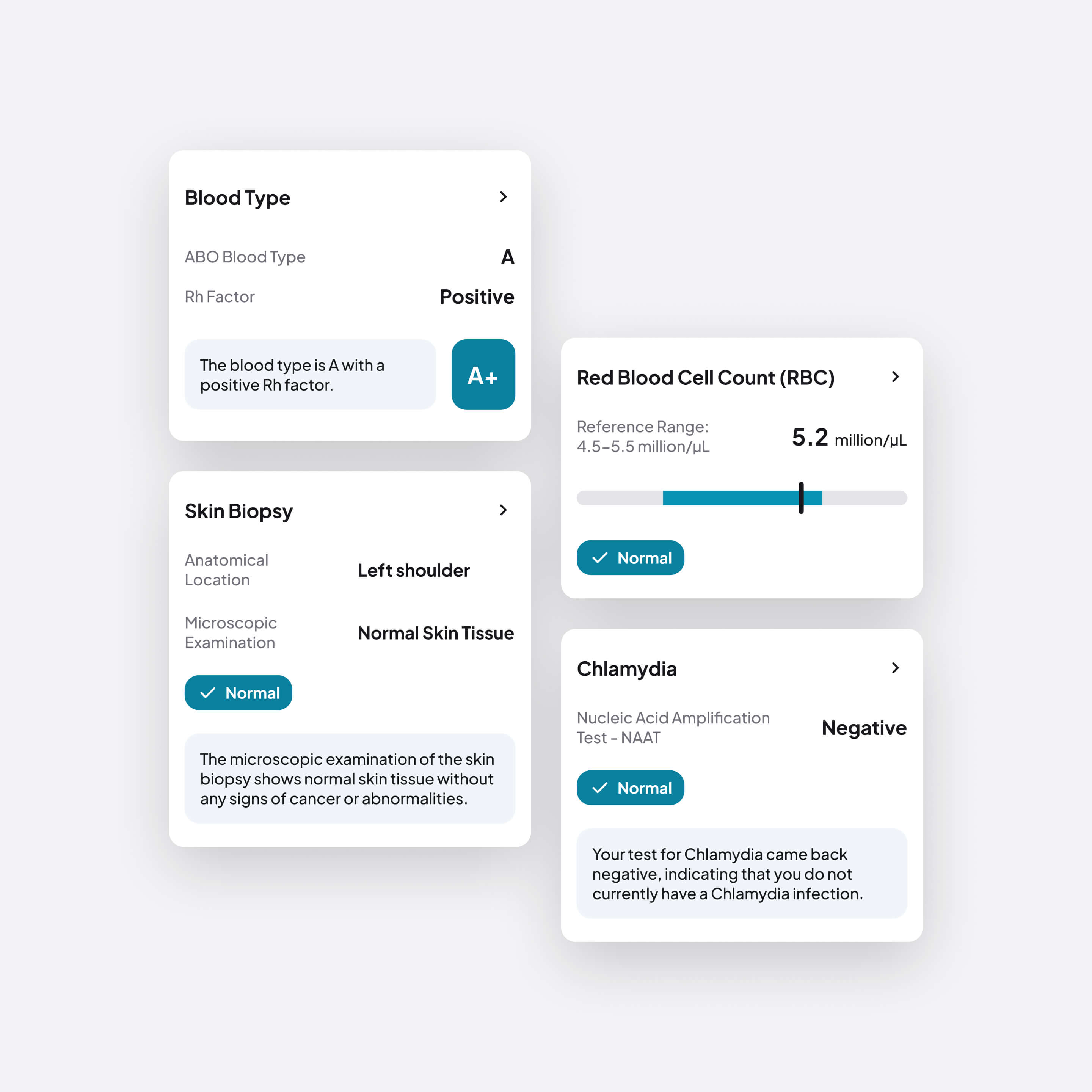
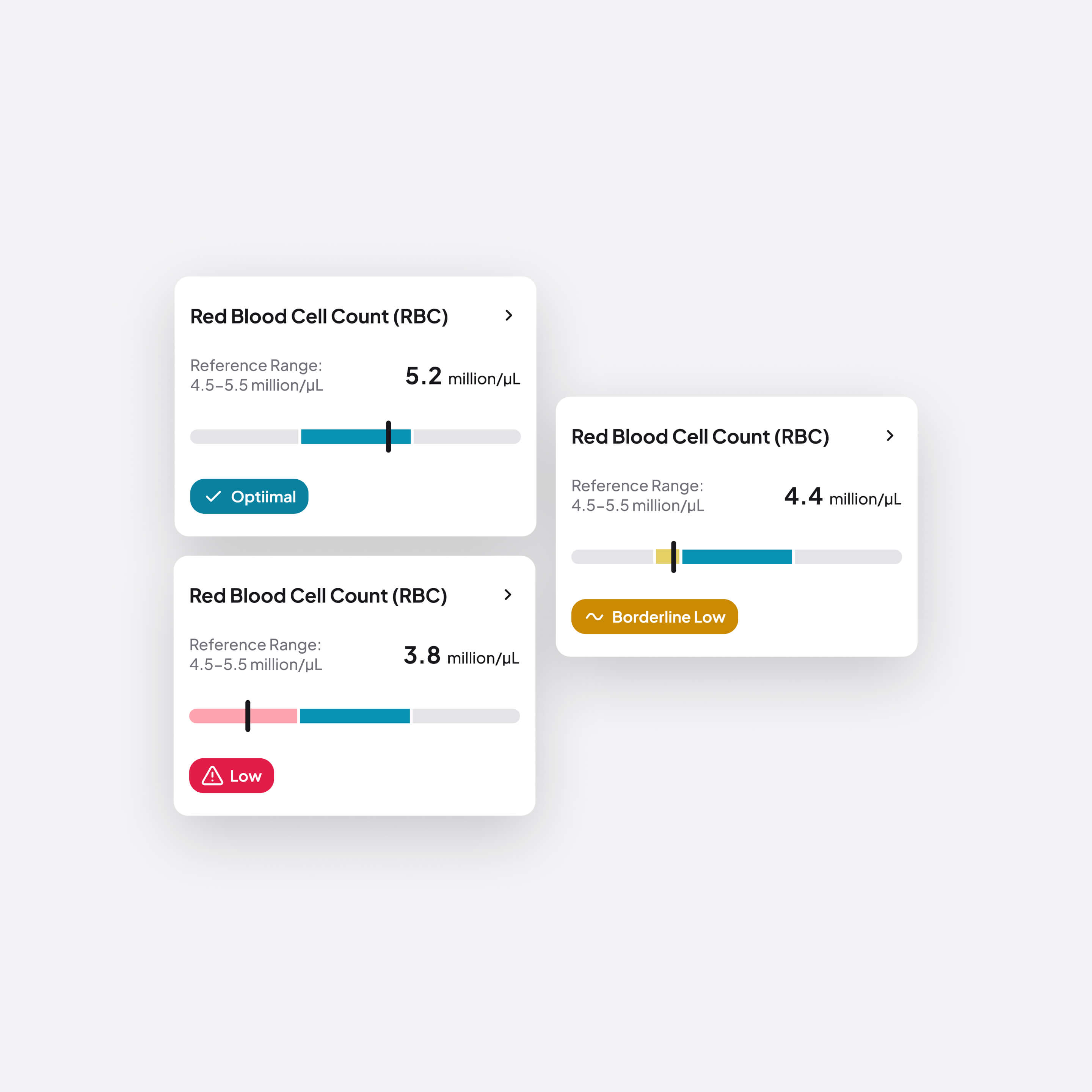
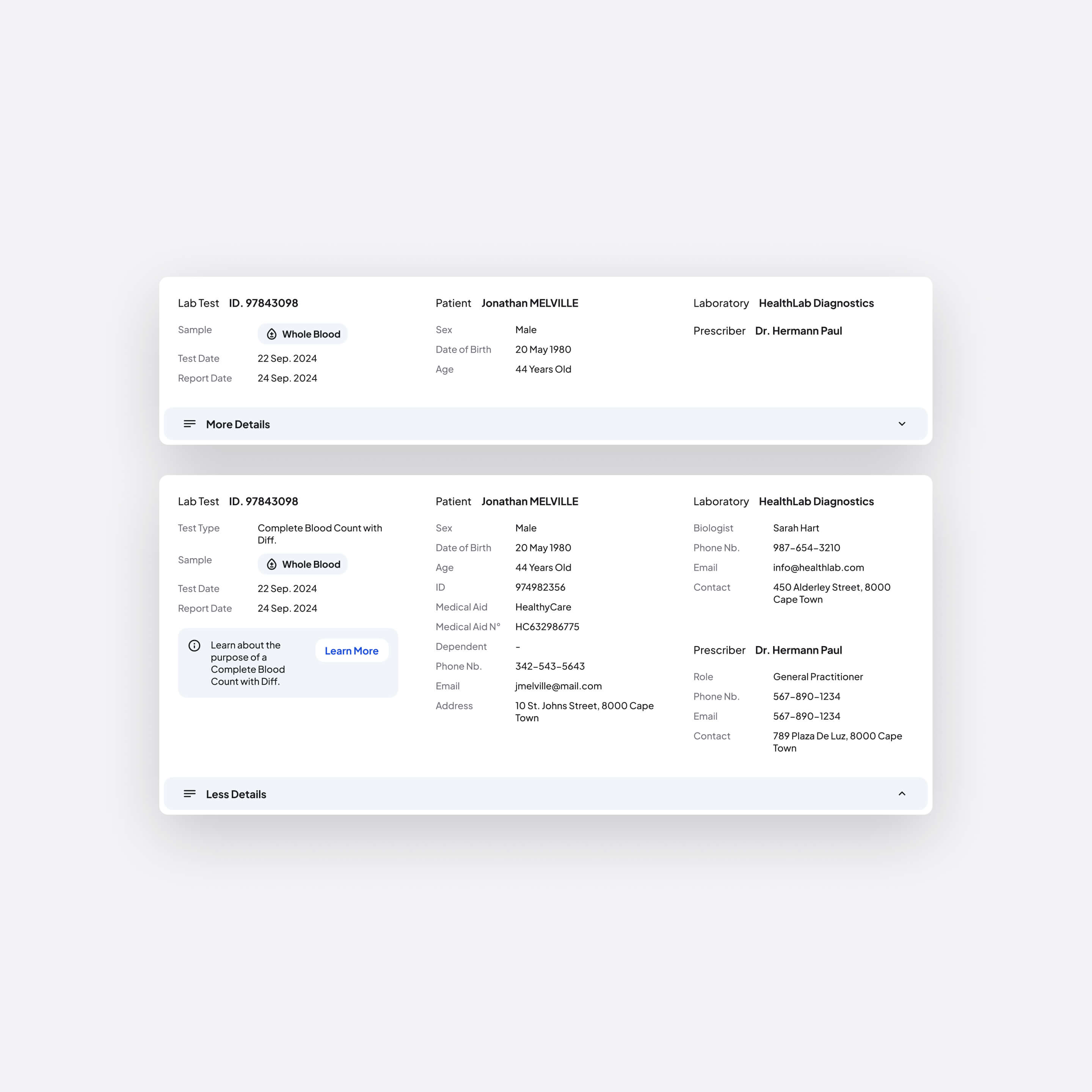
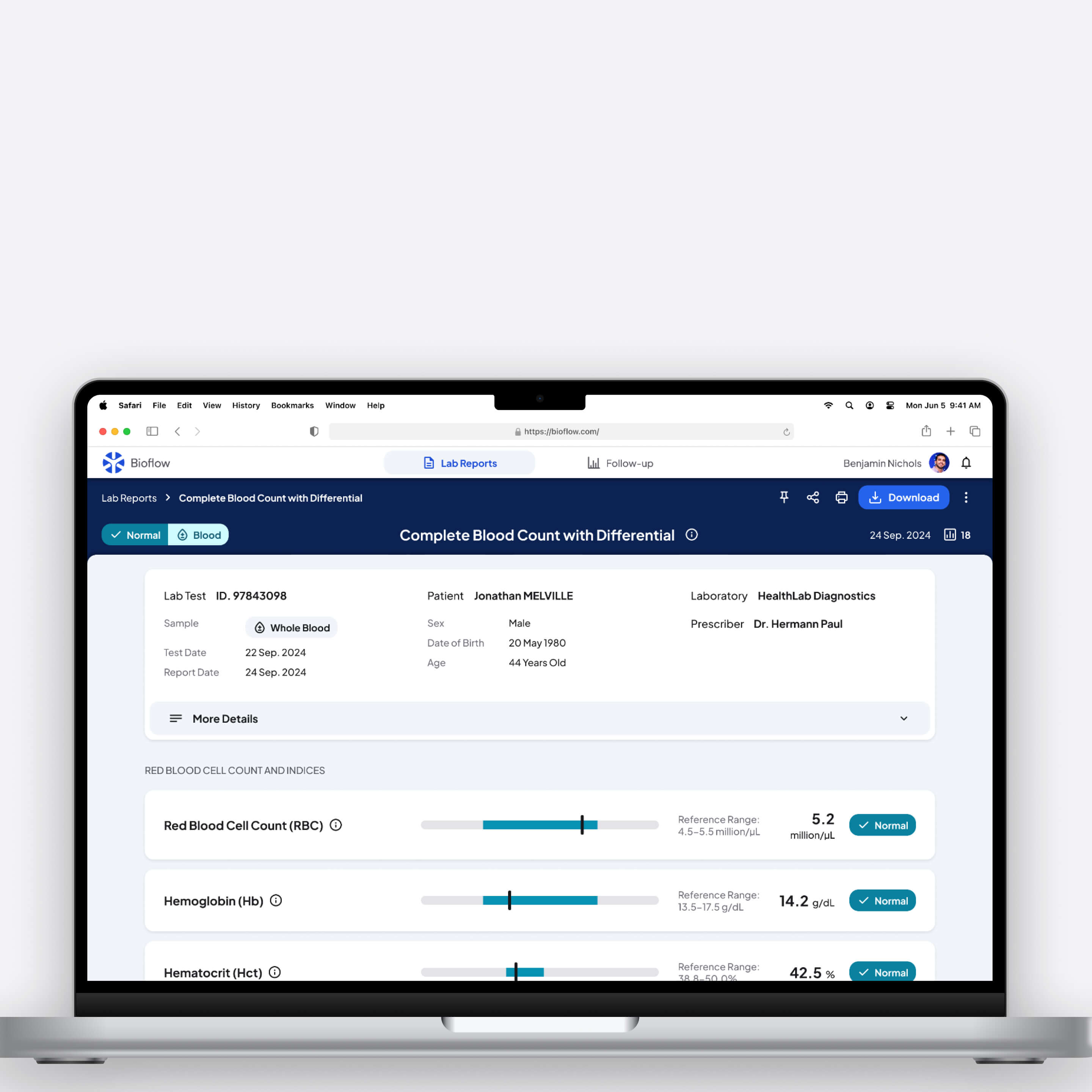
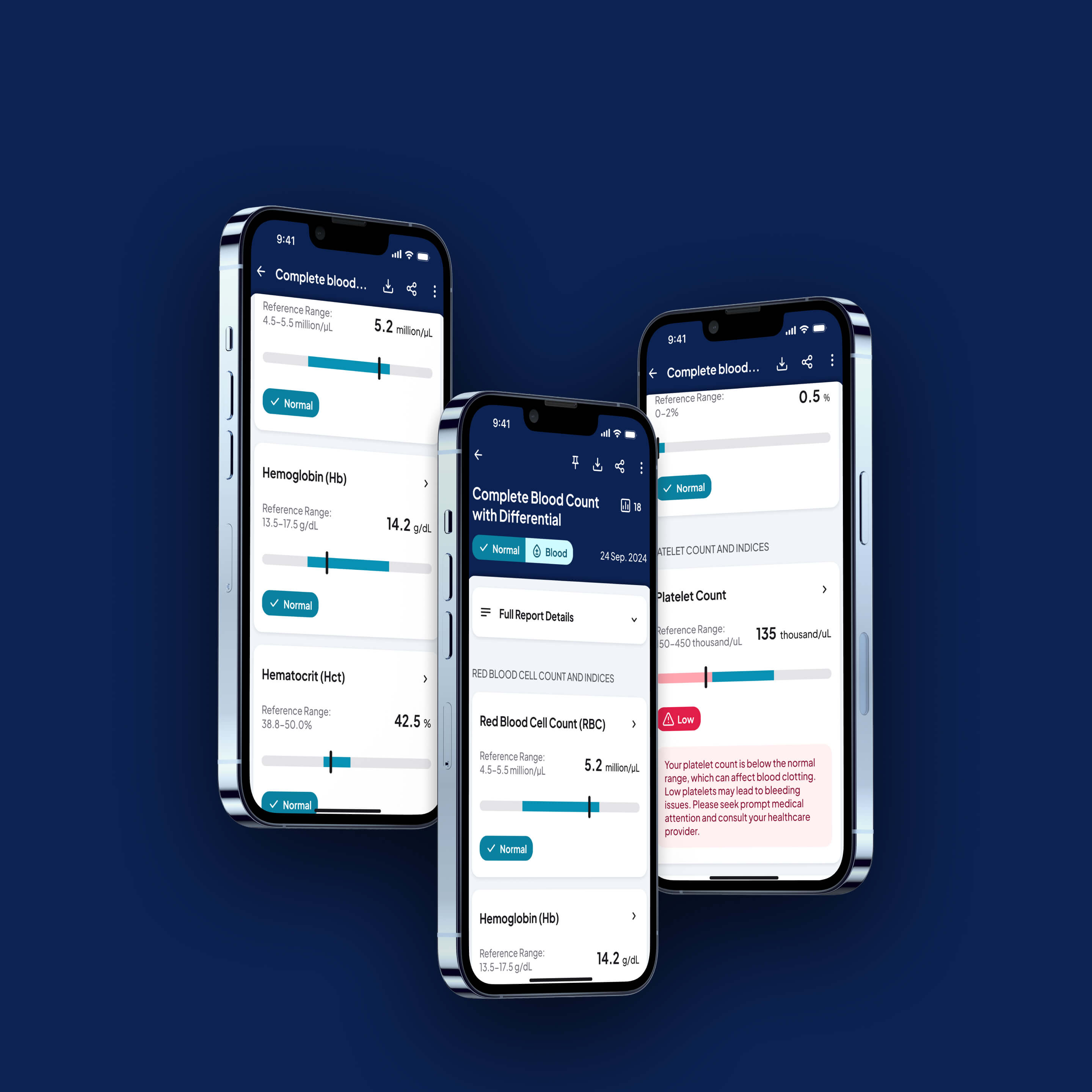
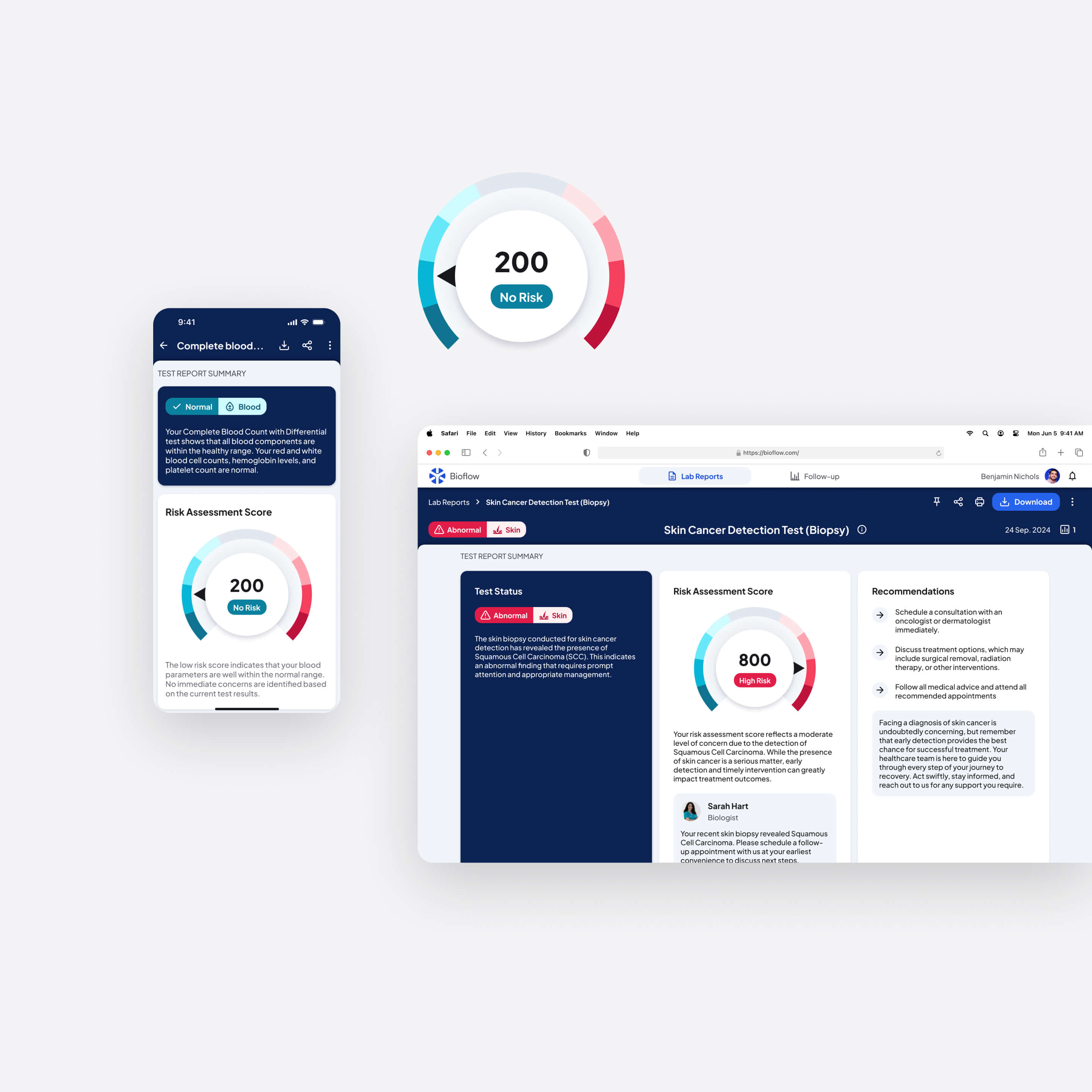
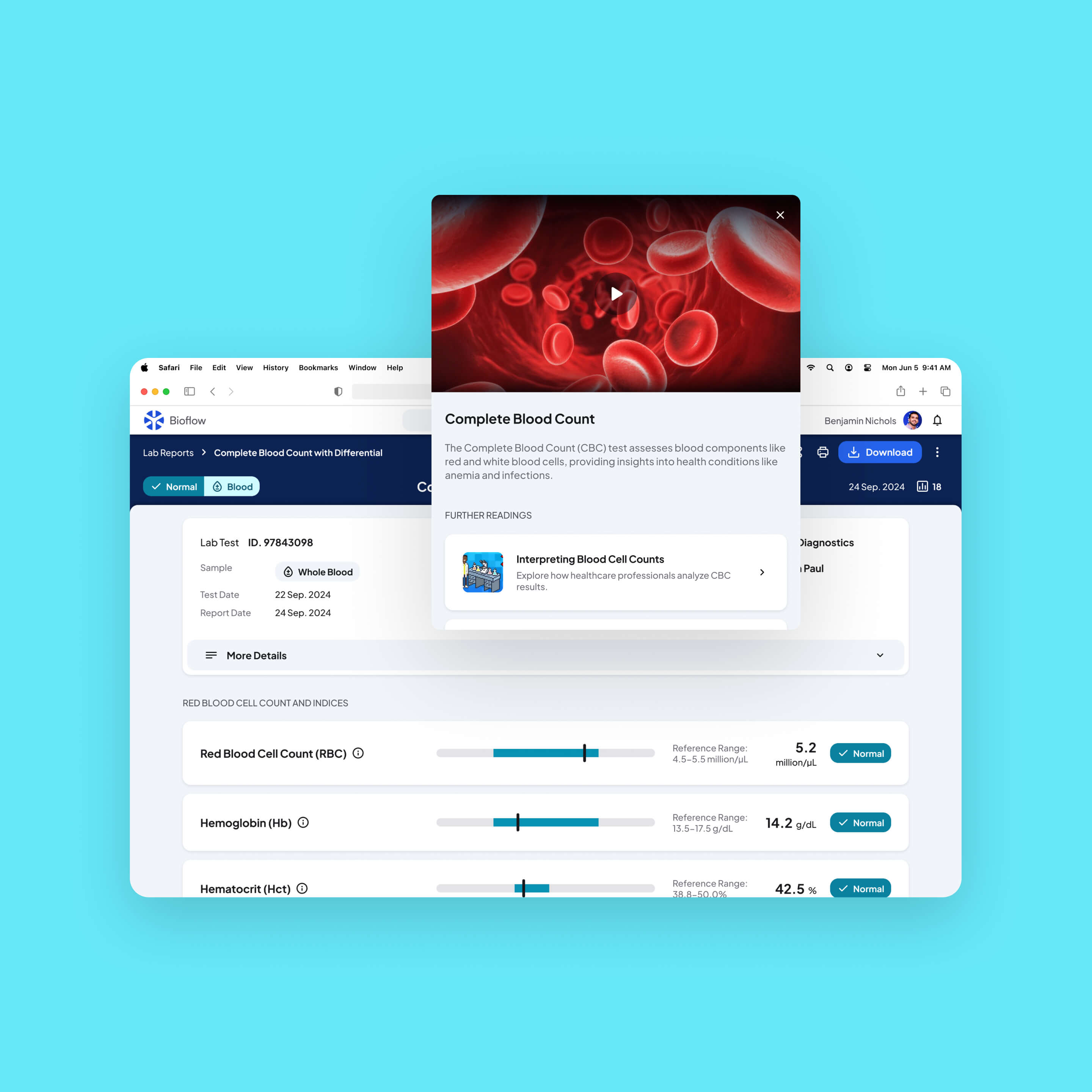
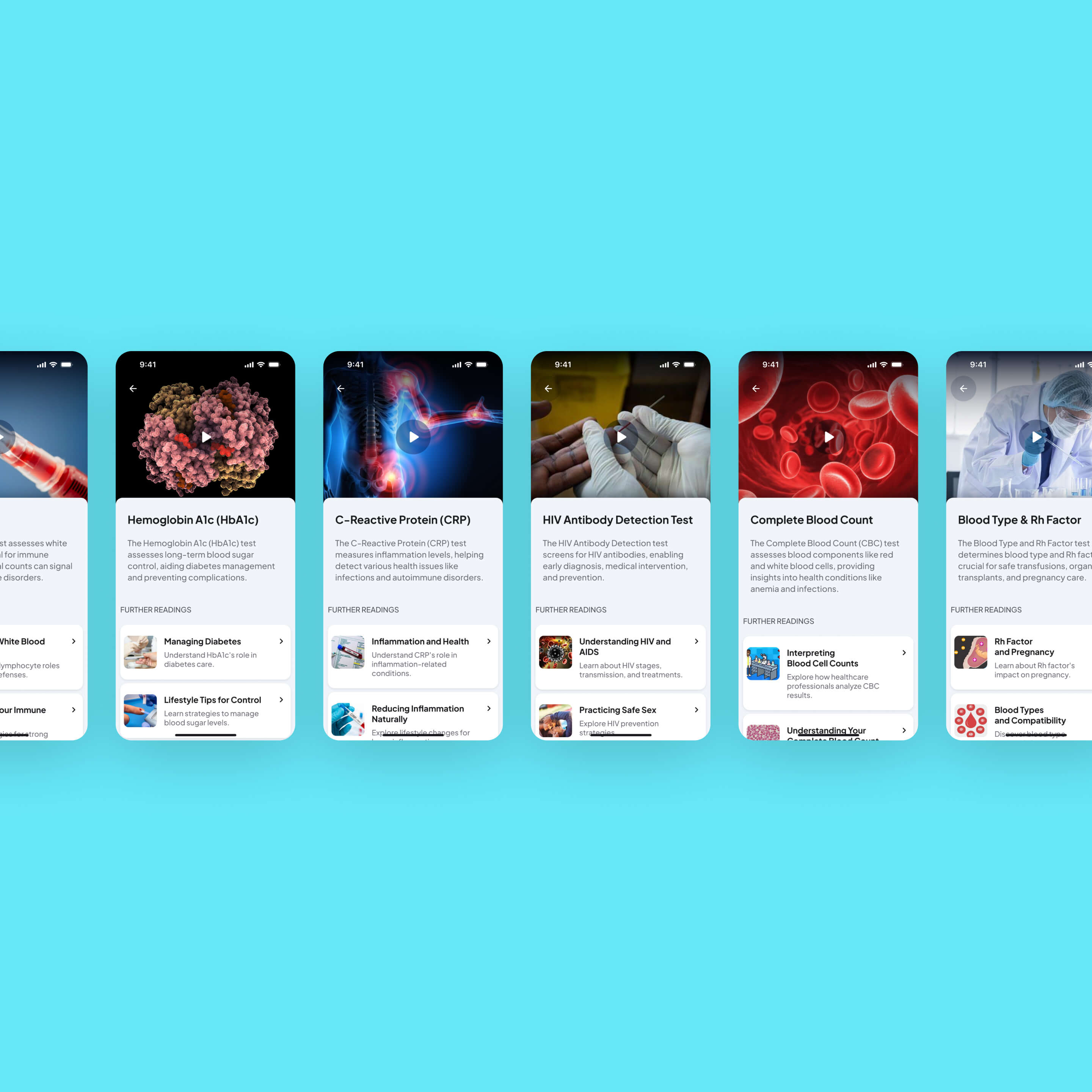
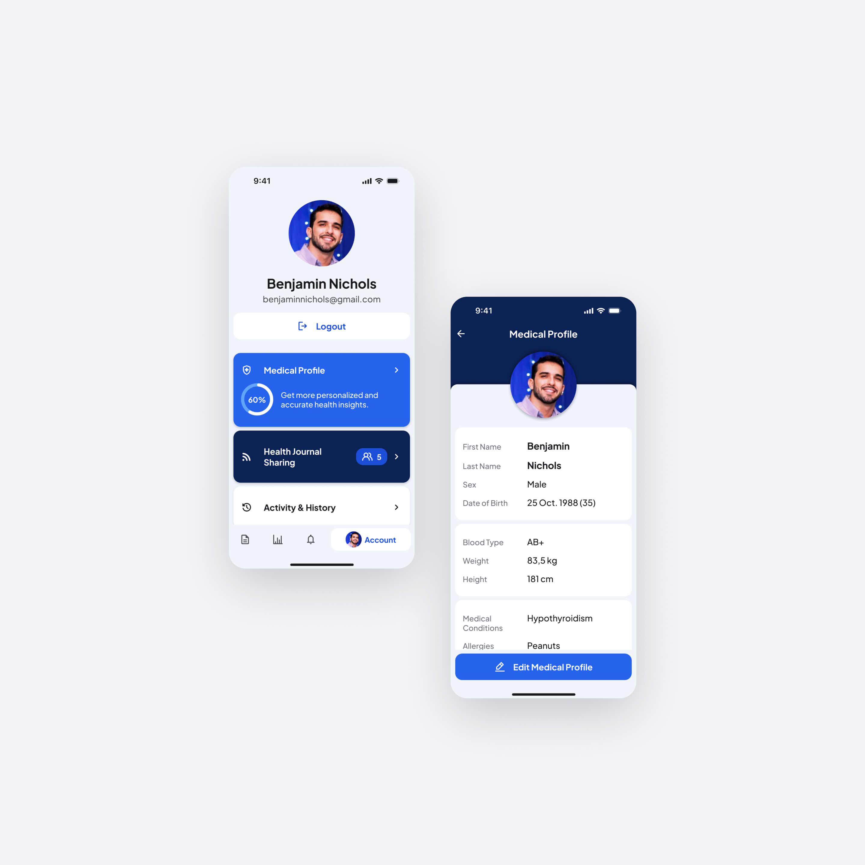
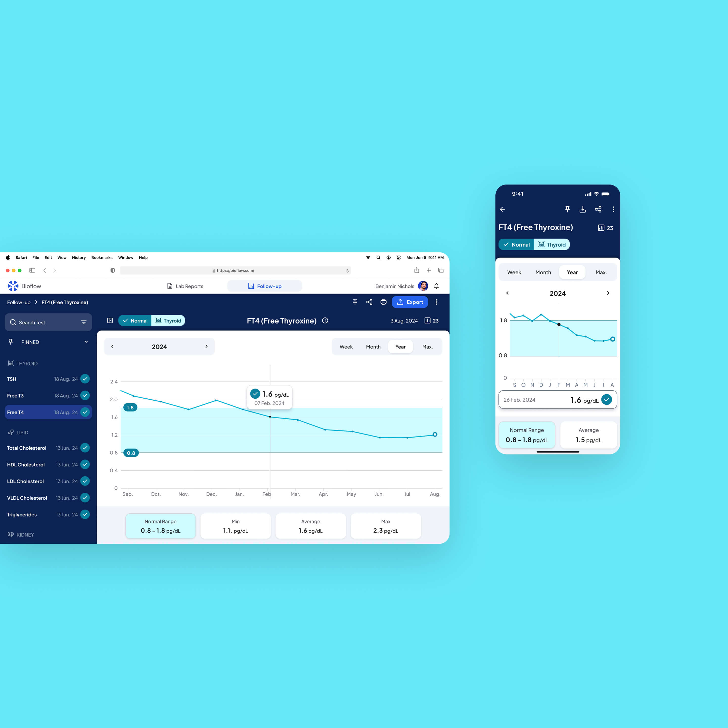
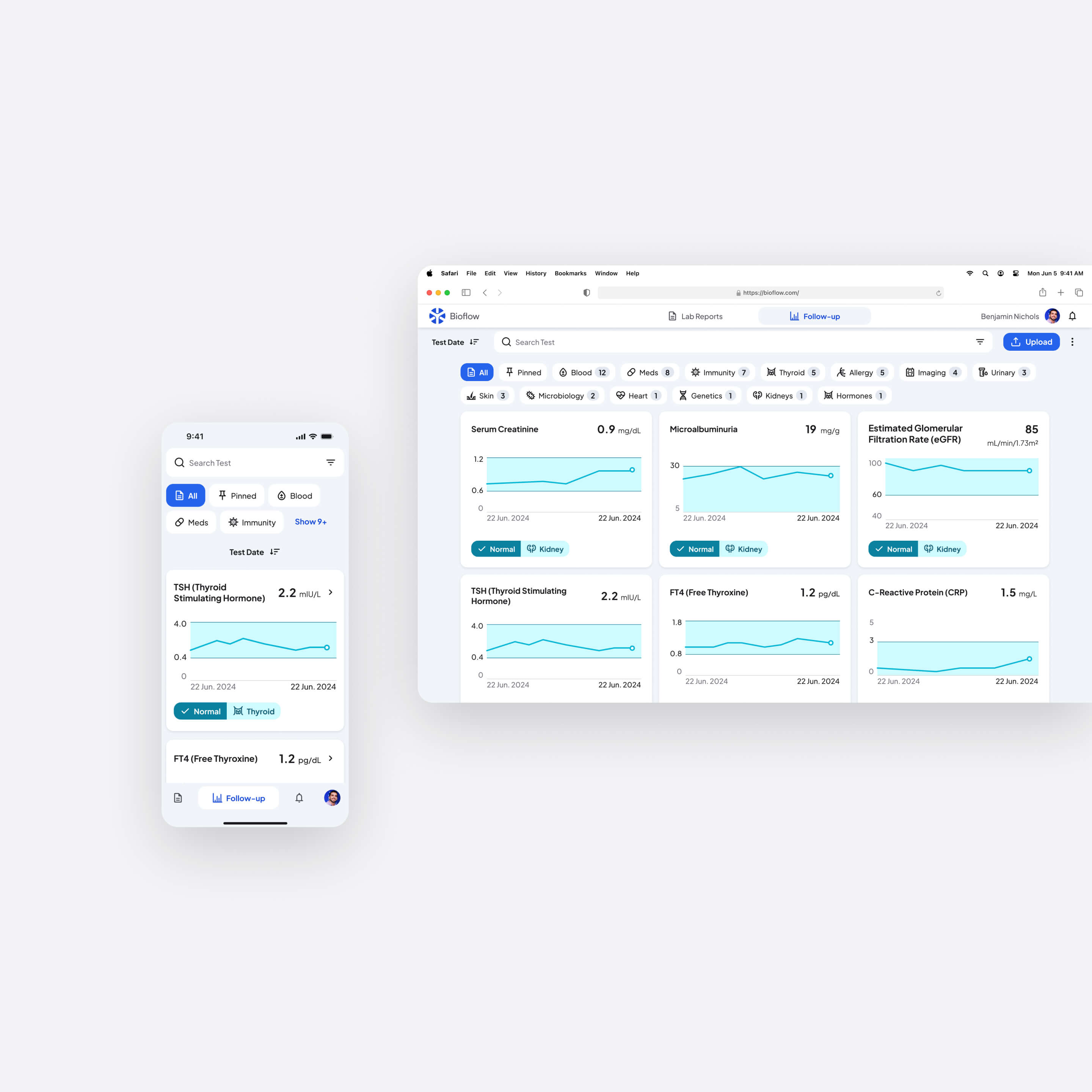
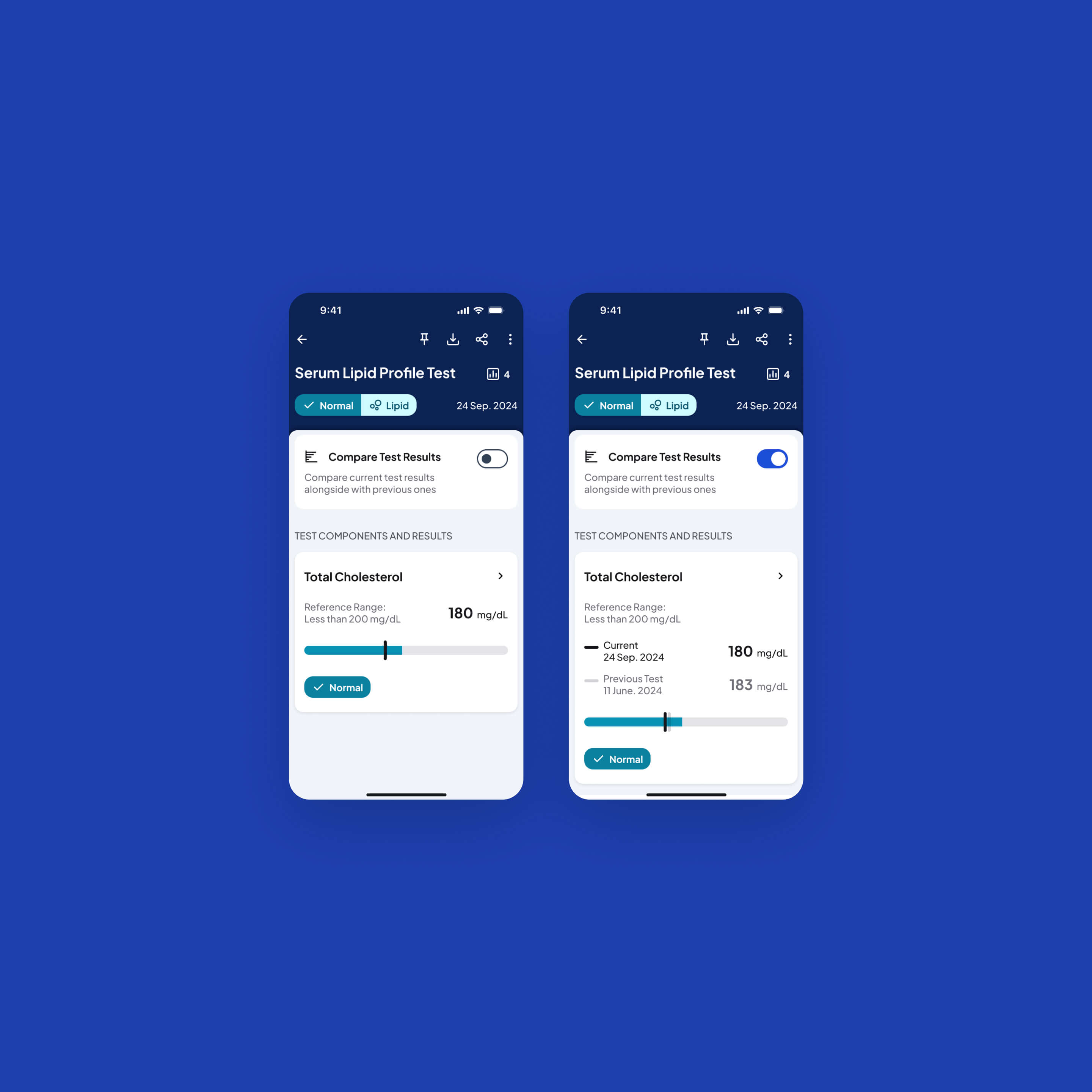
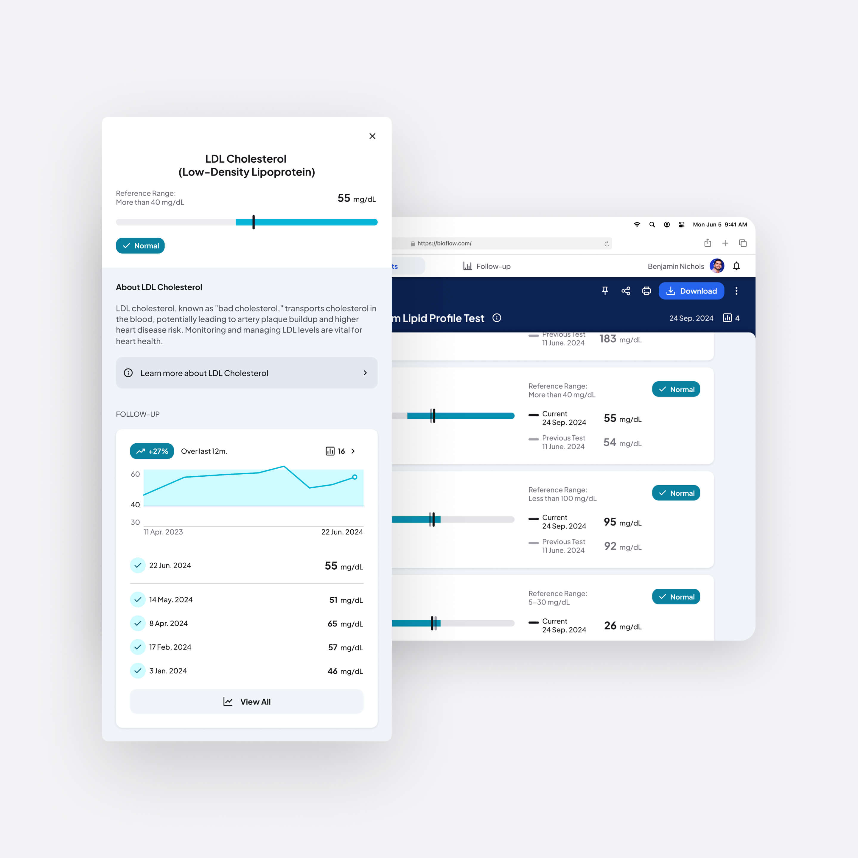
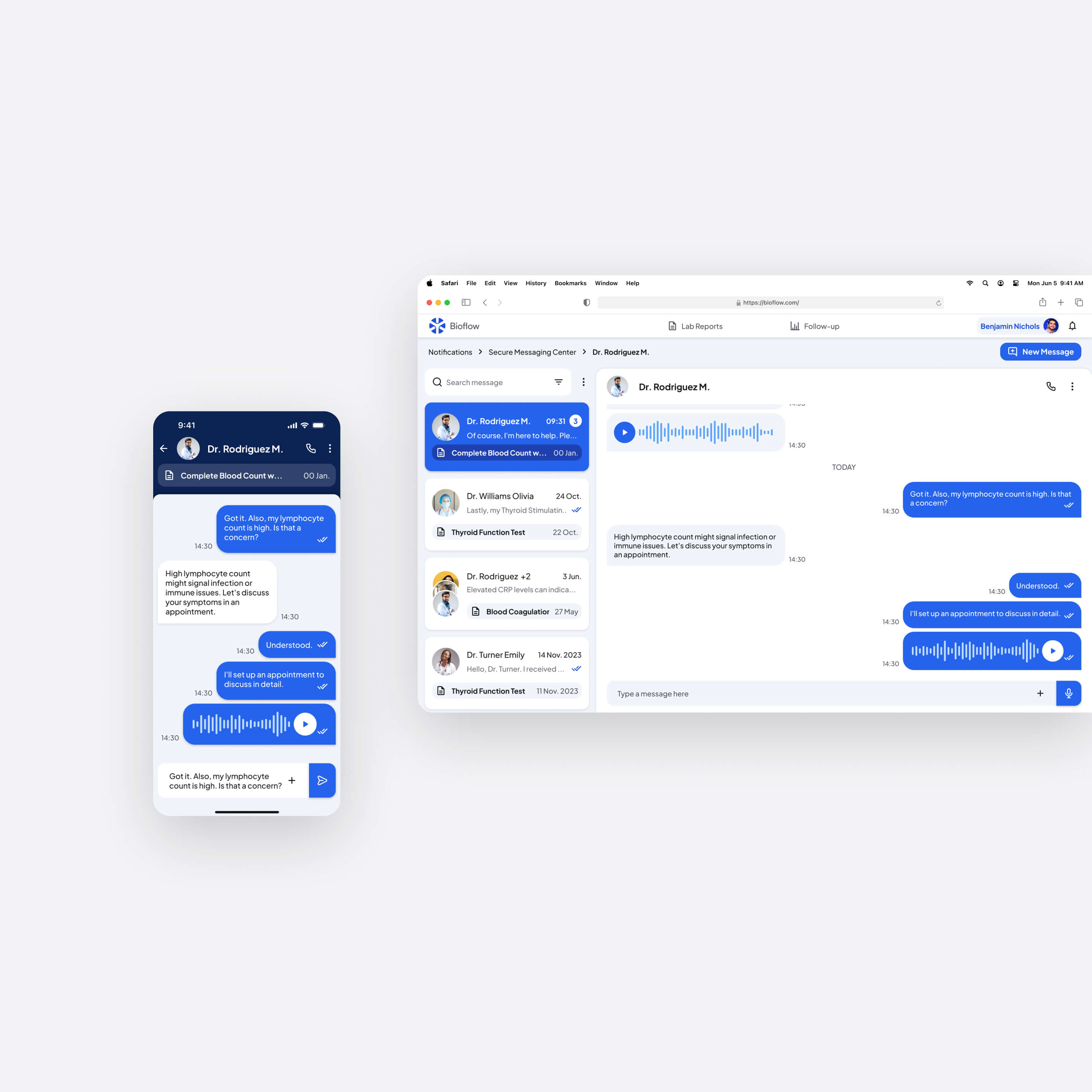
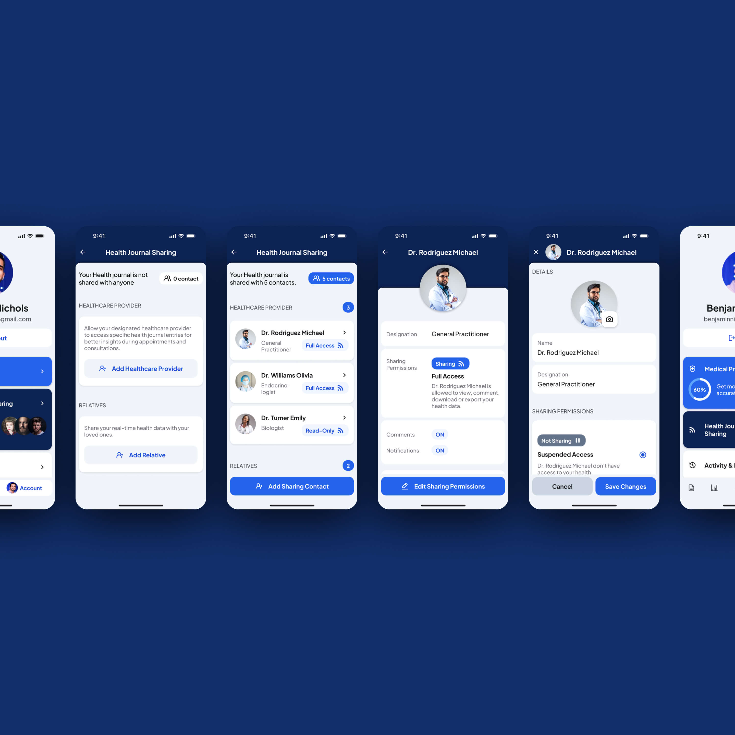
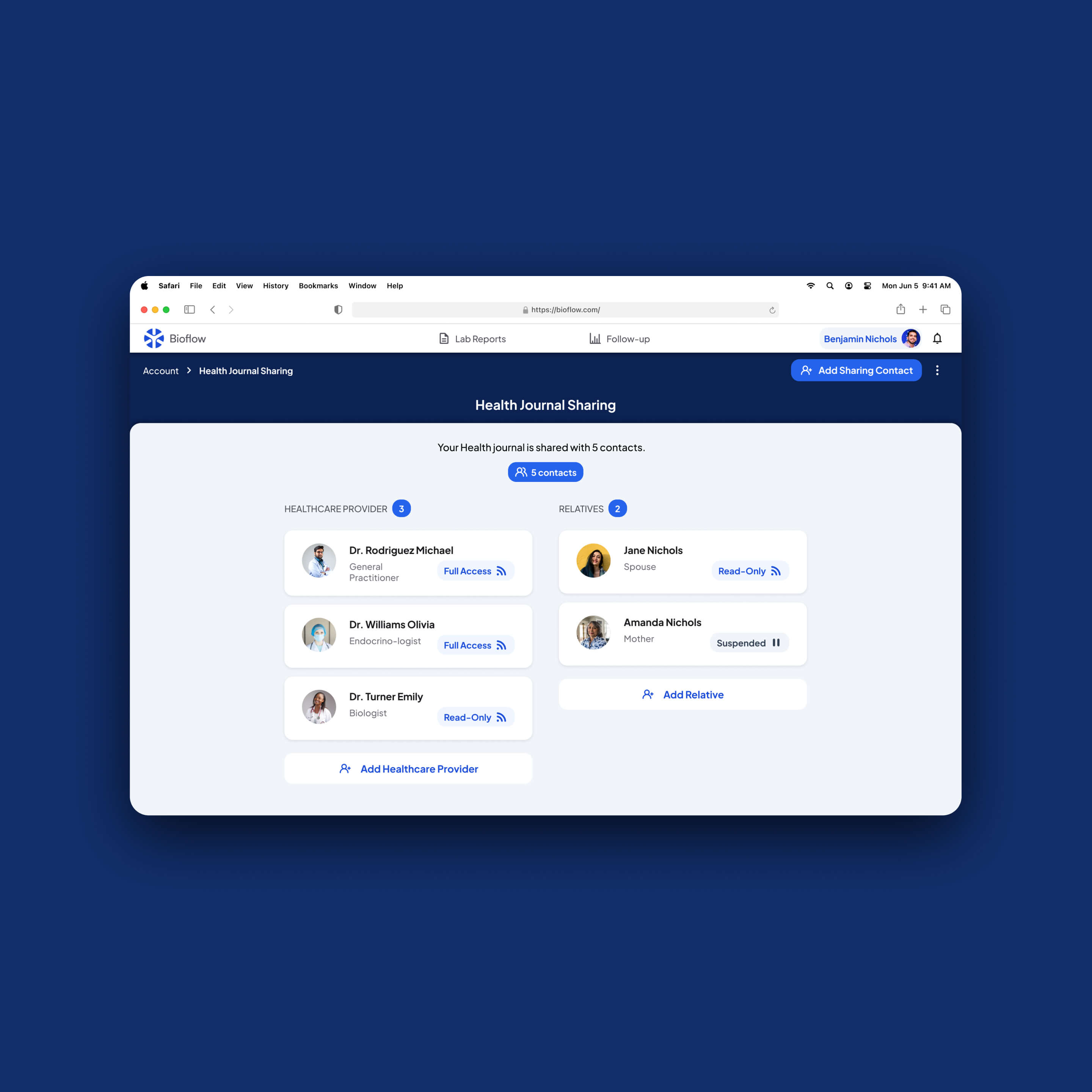
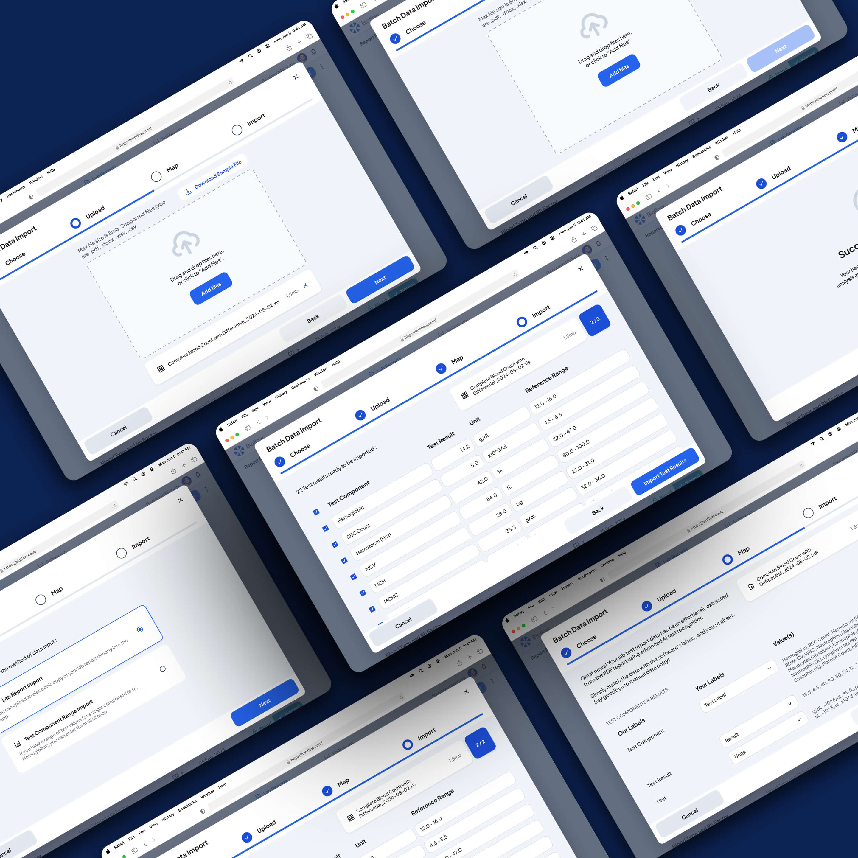
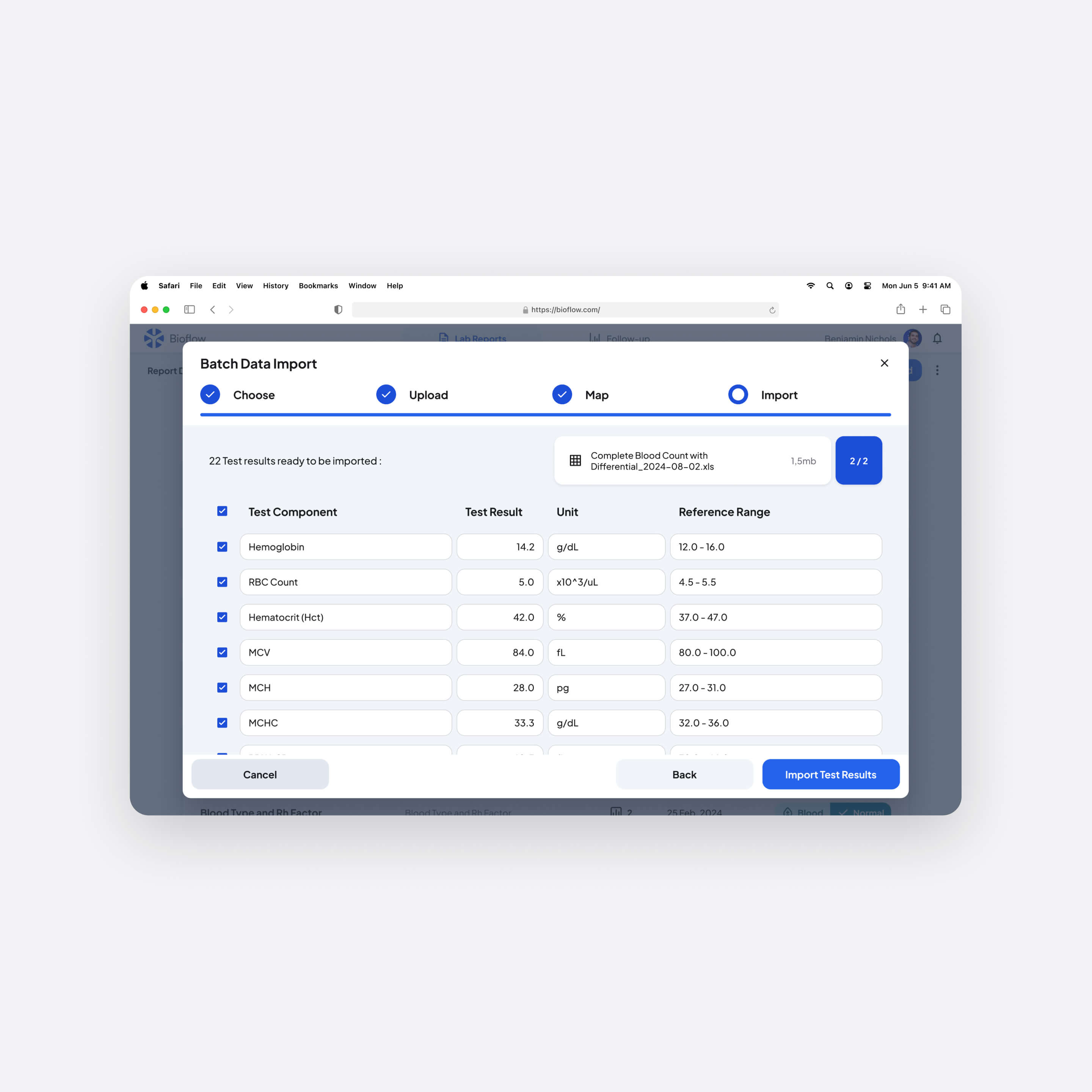
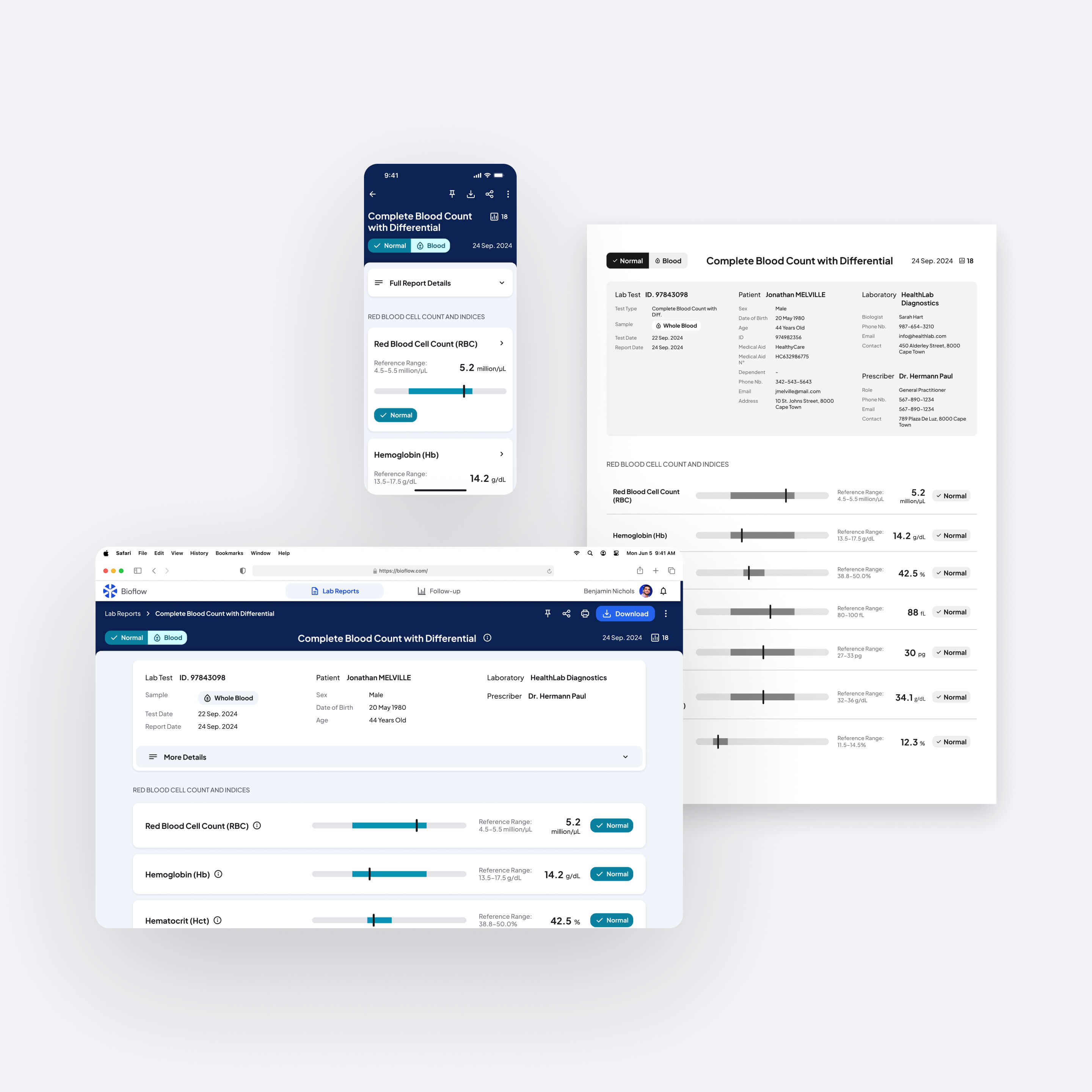
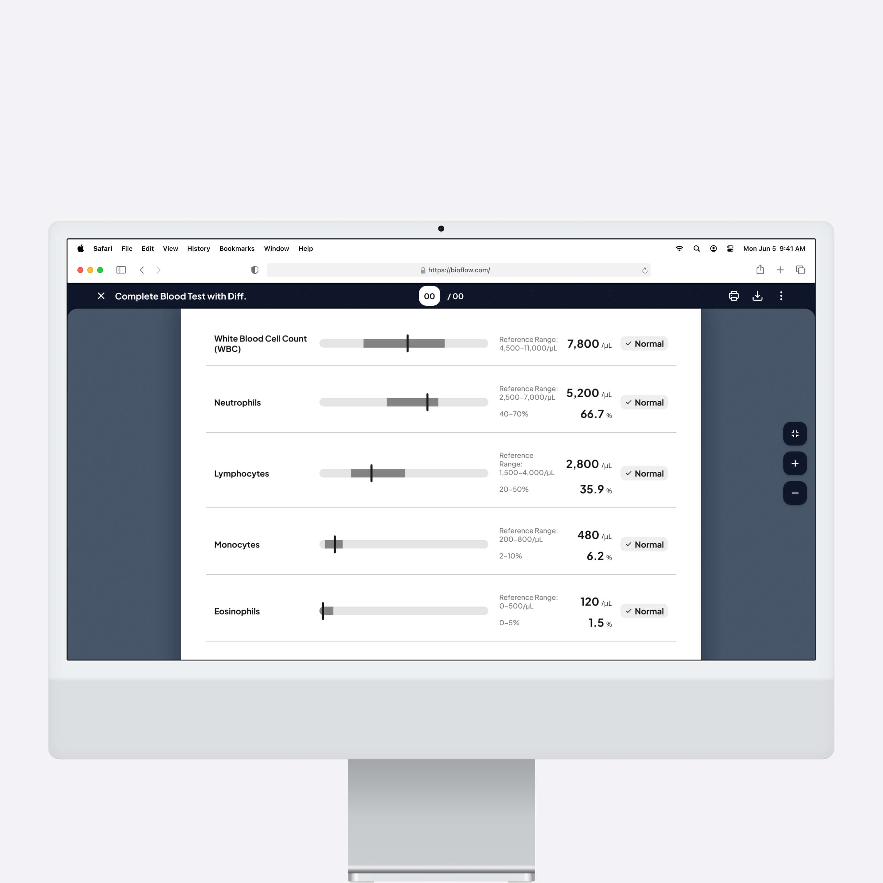
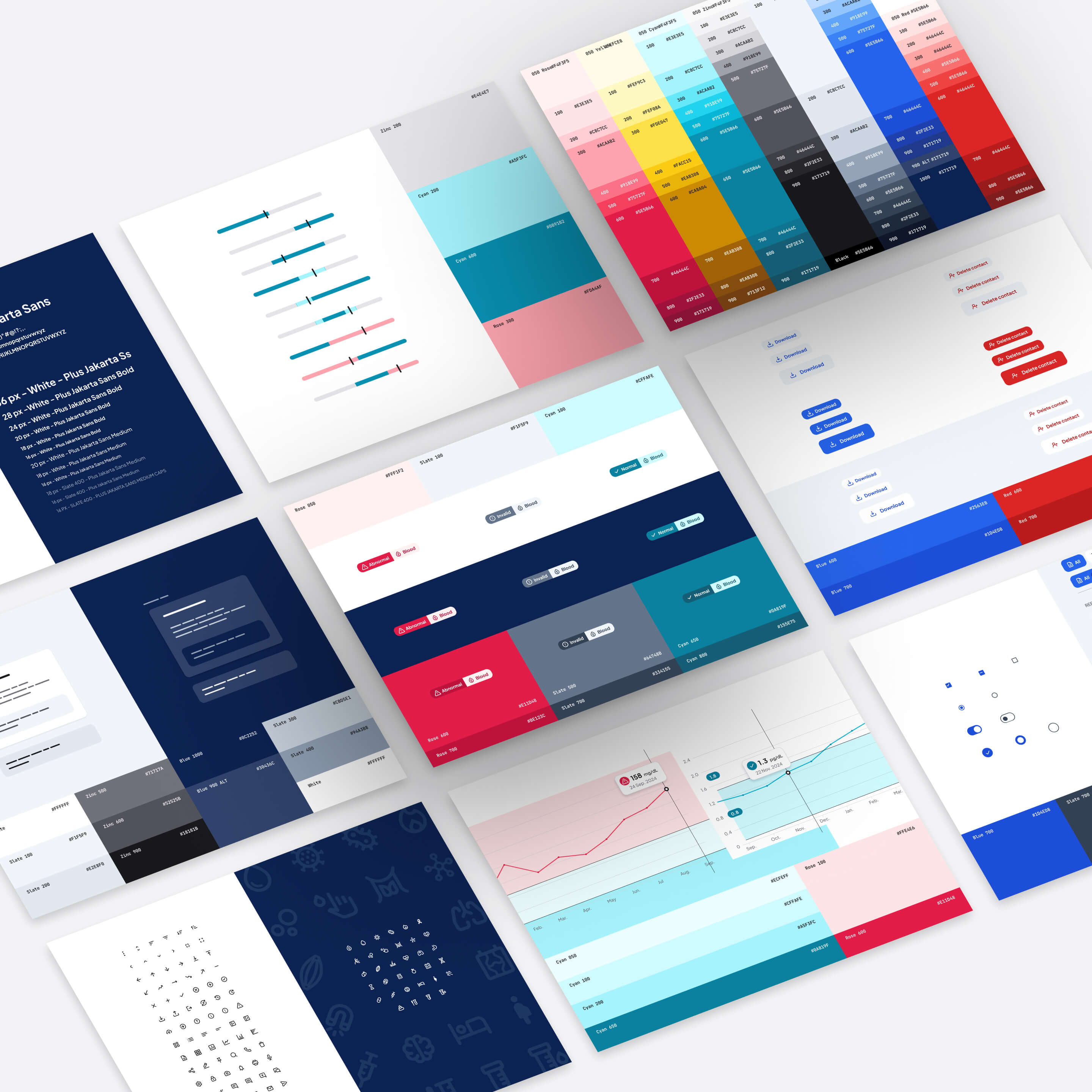
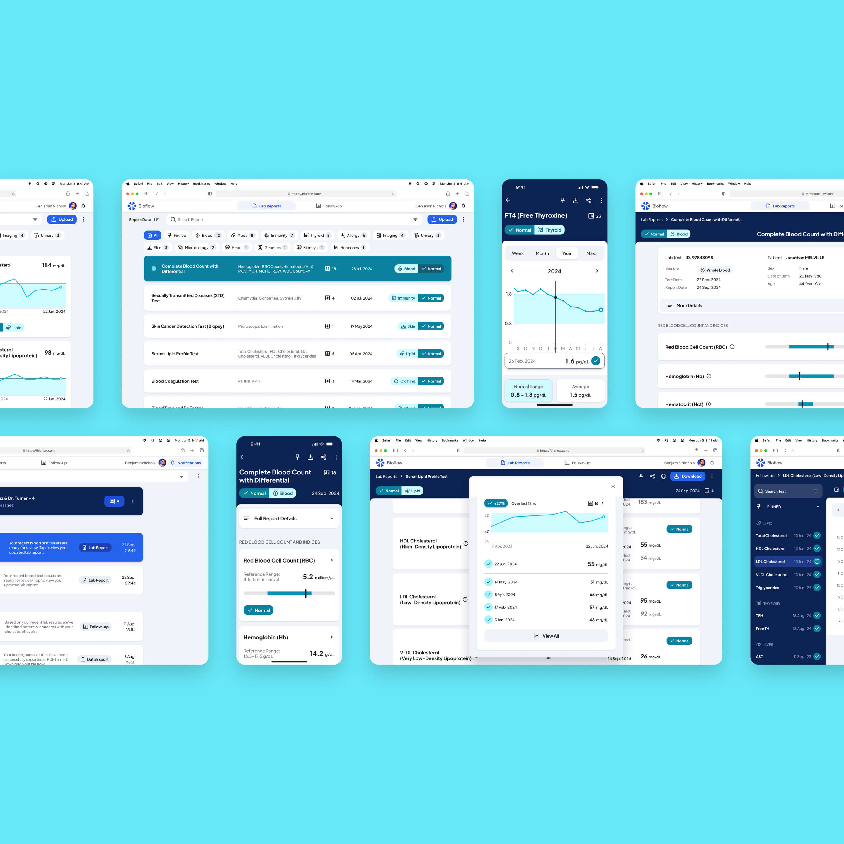
Designed a patient-centric digital lab report platform from 0→1:  transforming dense, print-based medical documents into an interactive experience structured around clarity, hierarchy, and contextual guidance.

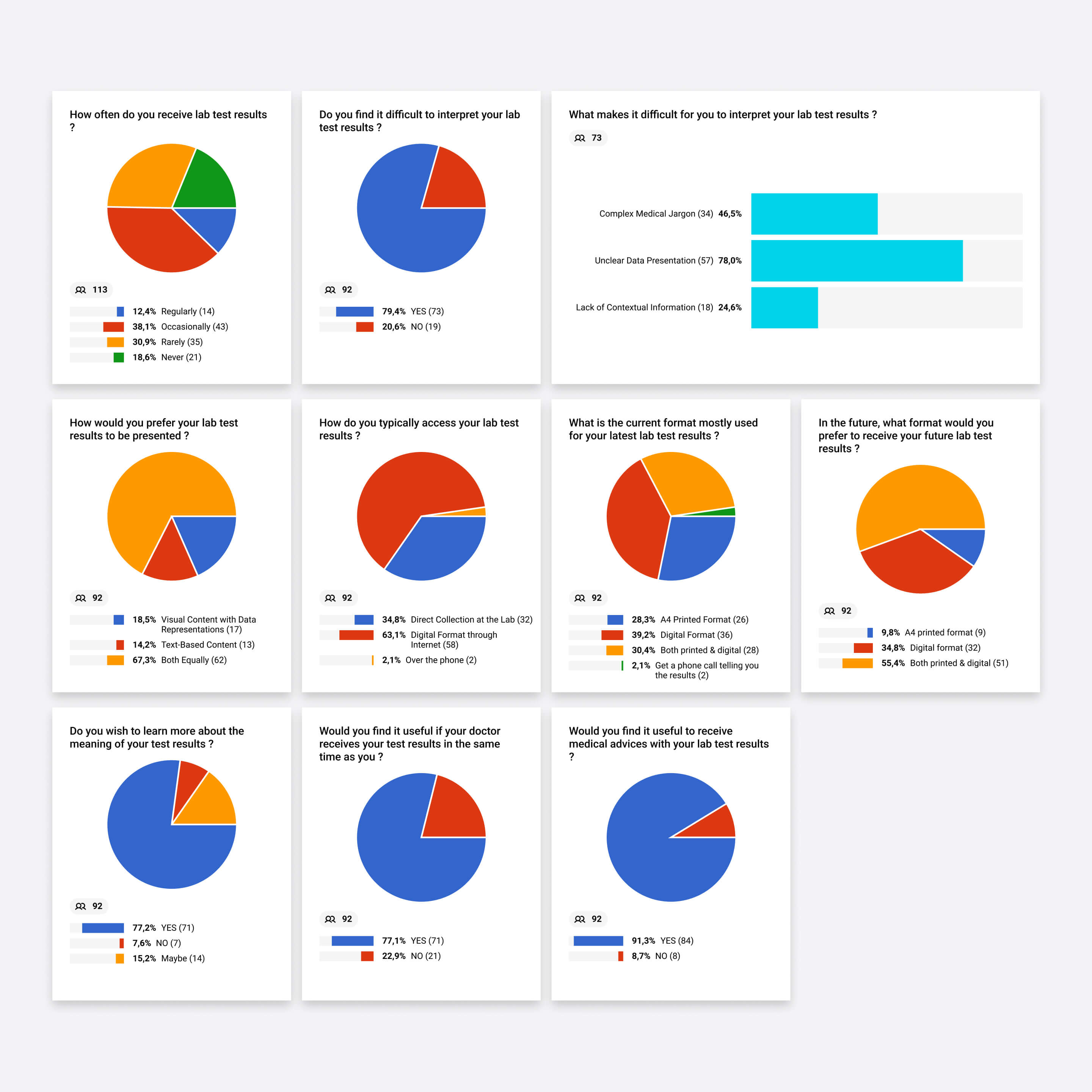
The work addresses a high-stakes information design challenge: helping patients understand sensitive health data without confusion or anxiety, while improving communication between patients, doctors, and labs.

Project Setup
Self-initiated project
Industry
Healthcare & HealthTech
Date
2023
Timeline
3 months
Role
UX/UI Designer
Team
Solo designer
Platform
Web & Mobile (Responsive), Print Exports (A4)
Keywords
HealthTech
Patient UX
Information Design
0→1
Data Visualization
Accessibility
Health Literacy
Overview of Bioflow digital platform both on desktop and mobile.
Problem

Medical reports designed for print, not patients

Lab test reports have barely evolved in decades. Still delivered as dense, print-centric documents with no visual hierarchy and no contextual guidance, they were never designed to be read by patients, yet that is exactly what happens. Patients receive results they cannot interpret, struggle to understand what values mean for their health, and are left anxious until they can reach a doctor.

Excerpts from lab reports show problems like hard-to-read content and lack of content hierarchy.
Excerpts from lab reports show problems like hard-to-read content and lack of content hierarchy, making it tough for patient to understand results quickly and without doubts.

During the COVID era, when lab testing surged and in-person consultations were limited, this gap became impossible to ignore. The problem was not access to data, it was the complete absence of meaning around it.

Photo of a biologist in a lab.
UI card displaying a redesigned lab test component result.
Photo by National Cancer Institute on Unsplash.
UX Research

Decoding how patients actually read health data, and where reports fail them

Content audit (100+ reports)

Analyzed existing lab reports across multiple countries and formats, mapping structural inconsistencies, missing hierarchy, and visual shortcomings. Revealed that problems were systemic and cross-regional, not edge cases.
Examining a specific lab report example, where a doctor has highlighted results by circling them with a pen.
Overview of numerous analyzed existing lab reports.
Summary of patient survey results.

User interviews & surveys

Engaged patients to understand how they read, interpret, and emotionally respond to receiving lab results. Surfaced widespread confusion, a strong desire for visual context, and anxiety driven by unstructured data, not by the results themselves.

Competitive analysis

Studied digital and paper-based lab report formats to identify patterns in visual communication, benchmarking against consumer health apps and professional diagnostic platforms, and finding a consistent gap between data richness and usability.
Utilized competitive analysis matrix for evaluating existing solutions that enhance visualization and interpretation of patient lab test results.
Overview of strengths and drawbacks of various existing solutions in the market.
"I get my results online but I have no idea if something is wrong. I just wait for my doctor to call."
— Camille / Patient, 34, regular blood tests for a chronic condition
"I end up circling the abnormal values in pen because there's no visual way to spot them quickly."
— Dr. Martin / General Practitioner
Key pain points

Flat reports, high cognitive load

Poor readability, weak hierarchy, and missing context create confusion and anxiety.

Flat structure

Lab reports lacked any visual hierarchy, making key results impossible to find quickly. Every value carried the same visual weight regardless of clinical significance.

Static, print-first presentation

Formats designed for A4 paper performed poorly on screens, with no adaptation for mobile or digital reading contexts.

Interpretation barriers

No contextual guidance, no status indicators, and no plain-language explanations, leaving patients unable to understand what values meant for their health without medical training.

Lack of personalization

Reports presented identical content regardless of patient profile, history, or risk level ; missing the opportunity to surface what actually mattered for each individual.
UX Strategy

From static medical text to meaningful patient insights

Reframed lab reports from passive clinical documents into interactive, patient-centered health experiences.

Flowchart visualizing interactions between patients, doctors, and lab biologists throughout their user journey.
01

Visual clarity

Redesigned report structures with strong hierarchy, progressive disclosure, status indicators, simplified terms, and visual cues : making key results findable and interpretable at a glance, without overwhelming users with detail upfront.
02

Patient empowerment

Tailored insights, risk scores, and educational content to individual patient profiles and medical history : turning a generic document into a personally relevant health resource.
03

Professional integration

Connected patients, doctors, and labs through a shared platform with secure report sharing, collaborative annotation, and AI-assisted communication : improving diagnostic efficiency and continuity of care.
Bioflow app overview on mobile. / Various mobile views on the Bioflow platform, improving the user experience for viewing digital lab test results.
Iterations & Design Solutions

Designing interactive, patient-centric reports

I designed the full platform experience from scratch, covering every layer from report structure and component logic to interaction patterns, educational content, longitudinal tracking, and cross-format output. Each design decision was tested against two criteria: does it reduce cognitive load, and does it give the patient something they can act on? The work resulted in a comprehensive, scalable design system and a fully resolved concept across mobile, web, and print.

Scannable report hierarchy

Redesigned the top-level report structure with clear visual hierarchy, category groupings, and progressive disclosure, enabling both patients and clinicians to locate and assess key results in seconds rather than minutes.
Lab test report view on Bioflow platform, optimized for both mobile and desktop devices.

Structured component & adaptive result system

Mapped all possible test component types using a tree diagram, defining formatting logic for each category (numerical, qualitative, categorical results, and diagnosis) and built a modular card system ensuring every value is displayed in its clearest, most medically consistent form.
Tree diagram used to categorize test results based on their type and formatting needs
UI cards with various formatting of biological test results depending on their type.
UI cards for each lab test component, featuring clear status indicators to effectively communicate results and prevent misinterpretation.

Color & status indicators

Introduced a consistent color-coded status system (normal, borderline, abnormal) to communicate result significance at a glance, removing the need to decode reference ranges manually.

Health literacy enhancements

Simplified medical terminology and integrated intuitive icons across the interface, making complex clinical language accessible to users without medical backgrounds.
Diverse UI chips with icons serving as filters on the Bioflow platform.

Clutter-free progressive disclosure

Applied layered disclosure throughout, keeping default views clean and scannable, with detailed explanations, reference data, and educational content revealed only on demand.
Progressive disclosure implemented in a UI card to selectively reveal more or less information about lab test details, purpose, and context.
Dektop view of a lab test report header.
Diverse app perspectives of Bioflow platform, showcasing the presentation of intuitive lab test results.
Lab test summaries with visually intuitive and easy-to-read patient risk scores.

Insightful test summaries

Designed structured summaries combining outcomes, health implications, personalized risk scores, and follow-up recommendations ; giving patients a clear next step rather than a wall of numbers.

Educational deep dives

Integrated contextual educational content (articles, visuals, and videos) accessible directly from each test component, building health literacy within the natural reading flow.
Desktop pop-up window for educational content, providing explanations for a specific test component.
Diverse detailed views of educational content designed to explain complex lab test components integrated into a lab report.
Incorporation of patient health profile within the platform.

Comprehensive medical profiles

Conceptualized integrated patient profiles consolidating medical history, ongoing treatments, and conditions : enabling personalized result interpretation and improving diagnostic precision.

Holistic biomarker tracking & comparison

Designed trend visualizations and result comparison tools to track biomarkers over time and surface progression patterns: turning isolated snapshots into a longitudinal health picture.
Visualization of a specific biomarker tracked over time andpresented in a chart view.
Screen displaying an overview of tracked biomarkers over time, featuring charts for easy follow-up and intuitive summaries for trend analysis.
Mobile view of a test component with the option to compare result values with those of the previous test.
Pop-up window displaying an in-depth exploration of a test component, accompanied by additional information and relevant links.

Integrated communication system

Designed a secure messaging channel and chatbot support layer to handle routine inquiries, reduce medical staff workload, and ensure complex questions received timely, personal attention.
Mobile and desktop views of the secure communication channel, showcasing the chat feed between a patient and medical staff.

Secure health journal & sharing

Conceptualized structured sharing features enabling secure, configurable collaboration between patients, clinicians, and family members ; with the ability to send, receive, and annotate reports within the platform.
Series of mobile app screens showing health journal sharing features including contact list, sharing permissions, and access controls for healthcare providers and relatives.
Health Journal Sharing page showing five shared contacts divided into Healthcare Providers with access levels and Relatives with access status and options to add new contacts.
Sequential views of the desktop modal illustrating each step in the batch import process for lab test results on the platform.
Batch Data Import interface showing test components like Hemoglobin, RBC Count, Hematocrit, MCV, MCH, MCHC with corresponding test results, units, and reference ranges, ready to import from an Excel file.

Seamless import & export

Designed streamlined import flows enabling healthcare providers and patients to bring lab reports from external sources directly into the platform, paired with flexible export options including CSV, A4 PDF, and additional formats for easy sharing across clinical and personal contexts.

Accessible multi-format output

Ensured full responsiveness across mobile and desktop alongside flexible export options including CSV and a clean A4 print-ready format that preserves digital hierarchy and clarity for users who prefer or require a physical copy or structured data export.
Different formatting options for a lab test report on the Bioflow platform, including desktop, mobile, and printed A4 versions.
Desktop view of the modal for printing a digital lab report in clear black and white A4 format.

Design system evoking medical excellence

Built a clean, medically aligned design system covering typography, color, components, and iconography, anchored in a dark blue and light grey palette chosen to convey precision, trust, and clinical clarity.
Bioflow design system overview.

Brand identity fusing biology, clarity, and seamless workflows

Developed Bioflow's full brand identity including naming, tone of voice, logo, and visual language, balancing professional rigor with a simple, approachable aesthetic suited to both clinical and patient-facing contexts.
Various perspectives of the Bioflow logo, including an illustration of the Bioflow app tile on an iOS iPhone device.
Integration of the Bioflow logo into an image featuring a lab biologist with a microscope.
Visual explanation of logo construction: fashioned from the symbol of a biological molecule integrated into a circle to evoke the circular perspective of a microscope.
EXPECTED Impact

Patient empowerment and clearer health data communication

60%
faster for patients to locate key test results
88%
comprehension score in usability testing
40%
reduction in doctors’ annotation/review time
75%
of patients feel confident interpreting results independently

Reduced anxiety

Patients can locate, read, and interpret key results confidently, without waiting for a doctor to explain what they are looking at.

Higher health literacy

Visual structure, status indicators, and contextual guidance replace confusion with understanding across a range of medical literacy levels.

Faster clinical review

Clinicians benefit from the same hierarchy and visual clarity, reducing the time spent annotating or re-explaining results to patients.

Better care continuity

Secure sharing and integrated communication reduce friction between patients, GPs, and labs ; supporting faster follow-up and more informed consultations.
Various lab test report views in the Bioflow platform, designed with hierarchy and highlights to enhance scanability.
Takeaway

Redefining how patients understand health data

Bioflow started with a simple but consequential observation: patients were receiving some of the most important information about their bodies in a format they couldn't read. By approaching lab reports as an information design challenge, the project demonstrates how hierarchy, context, and personalization can transform anxiety into understanding. In high-stakes health moments: clarity isn't a UX nicety, it's a must.

Disclaimer

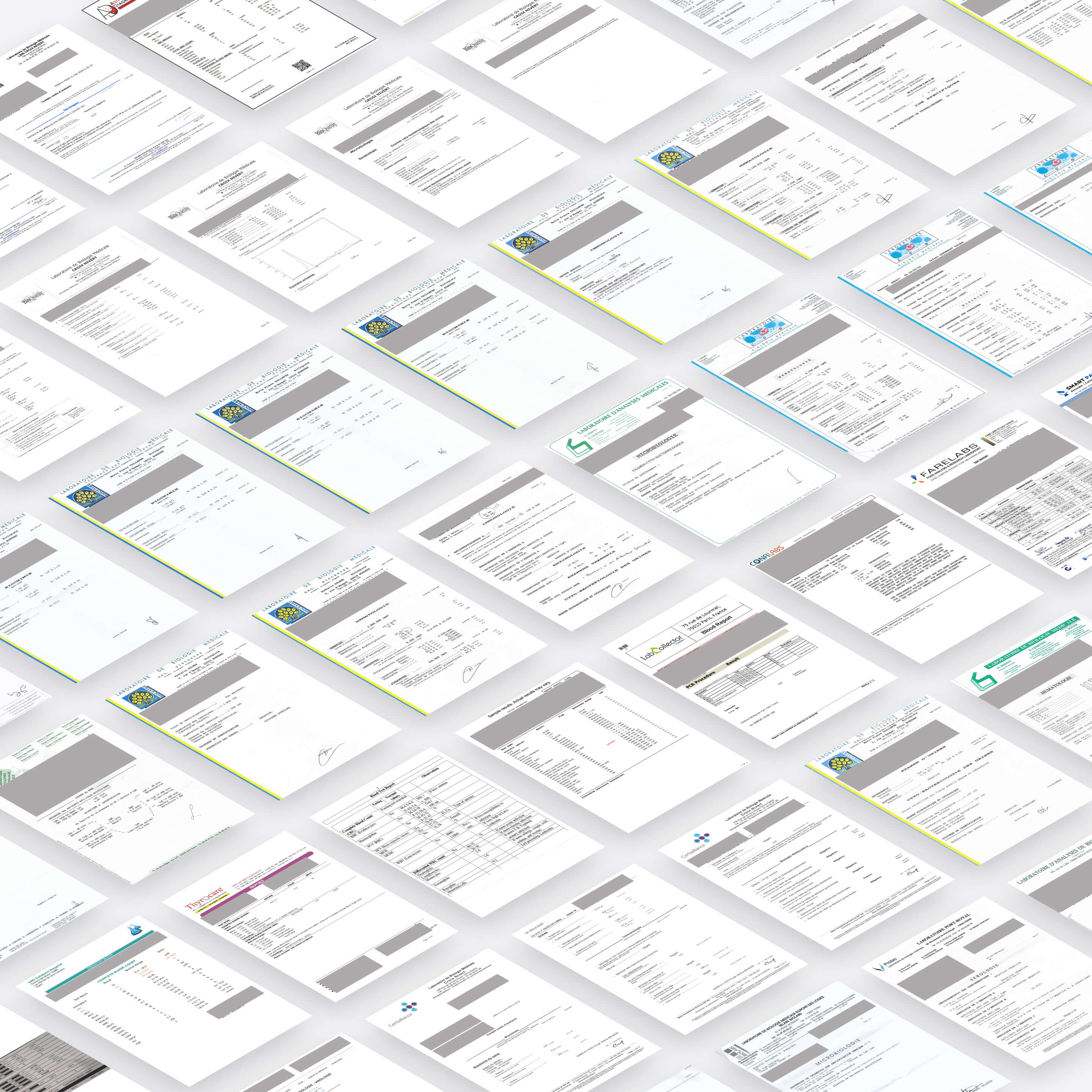
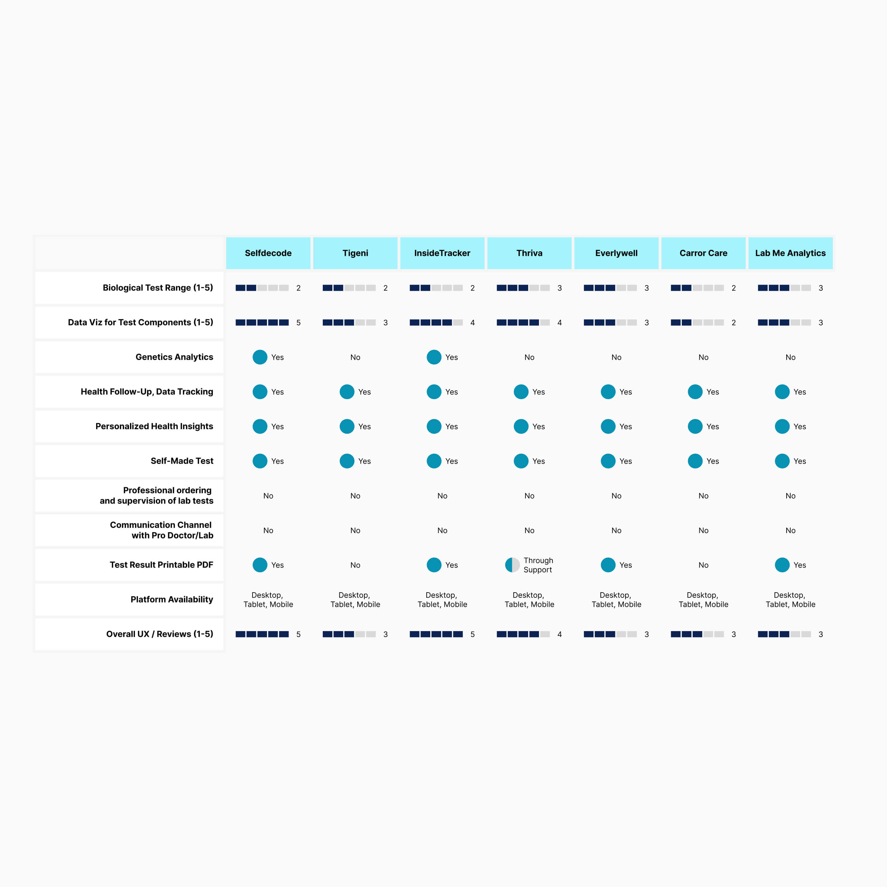
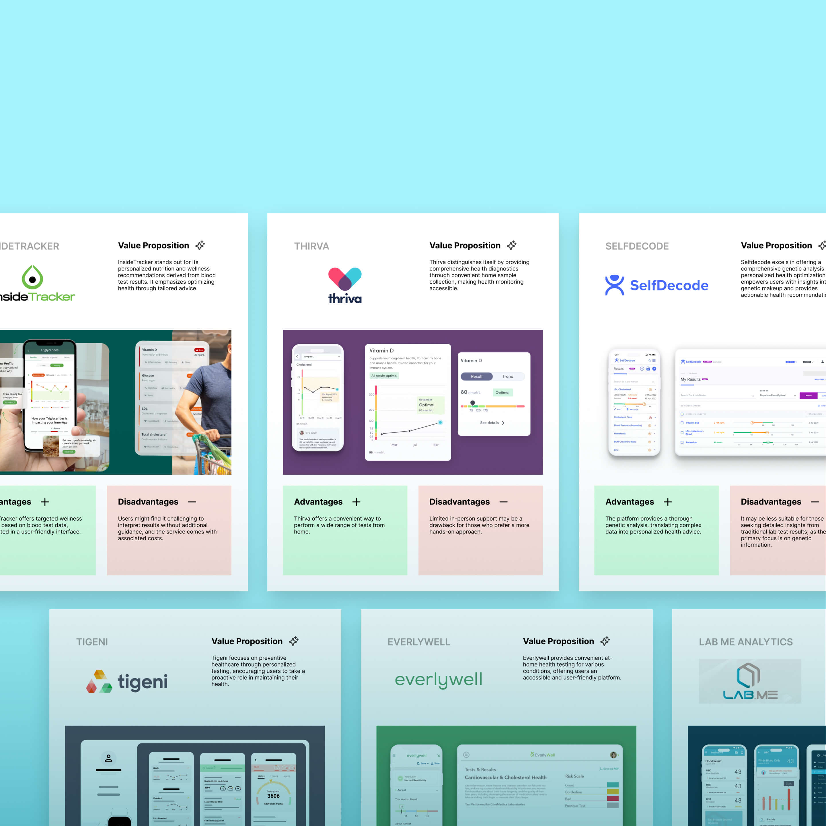
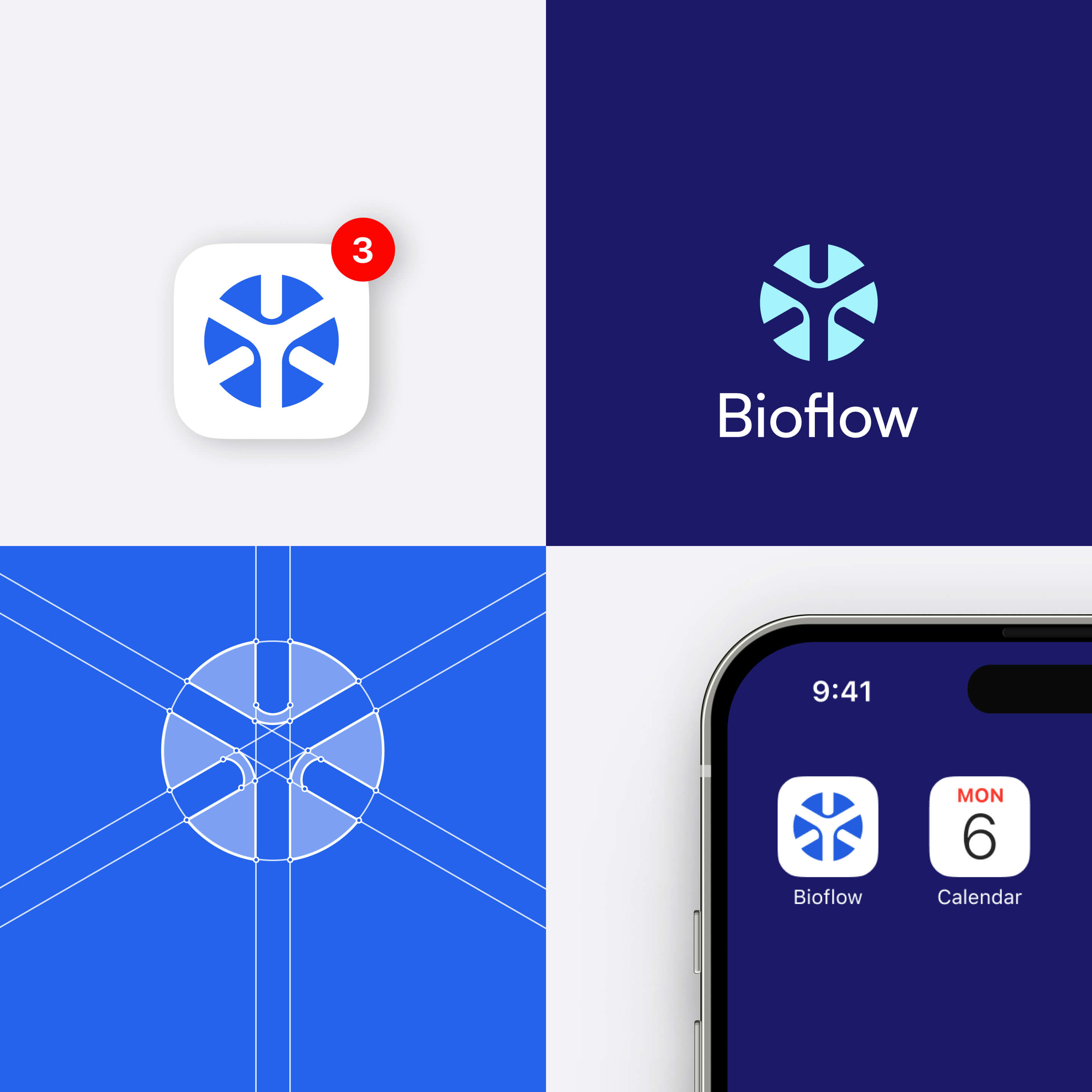
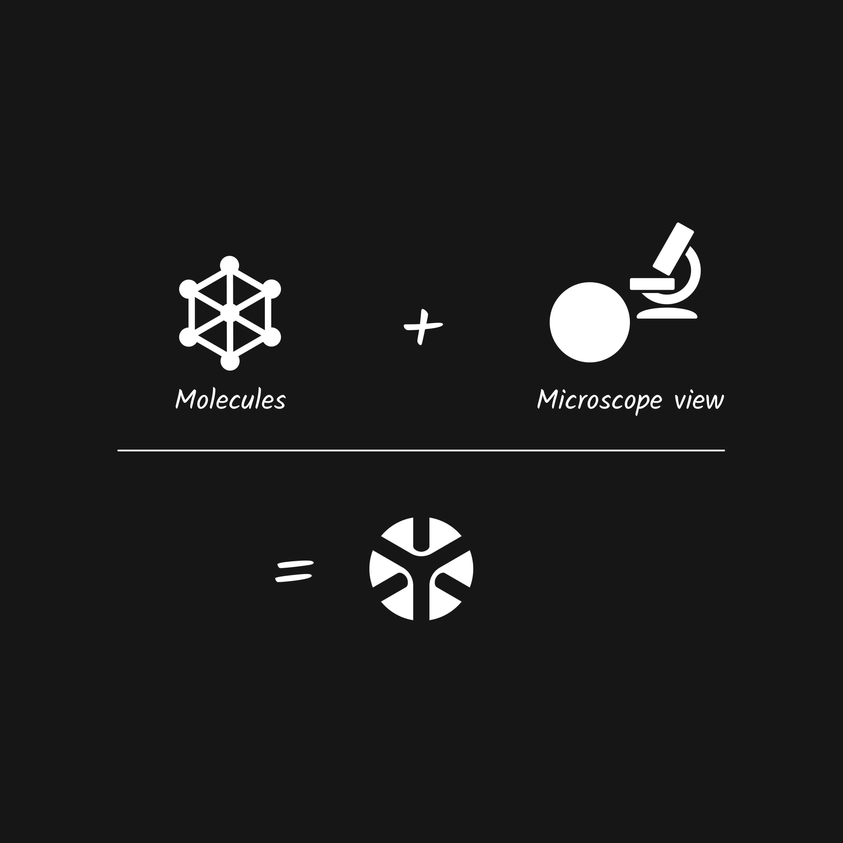
This is a self-initiated concept project. Bioflow is not affiliated with any existing laboratory, healthcare provider, or commercial platform. All content, screens, and data have been created for portfolio purposes to explore real UX and information design challenges in the health data space.

Any quantitative metrics presented reflect typical outcomes that could be expected from such a concept, but they are not based on real-world field data or validated measurements. They are illustrative in nature. I recognize that measuring UX impact is a critical step in any UX project, and that proper validation is essential to assess whether design decisions effectively move the user experience in the right direction.

Bioflow mobile home screen featuring all lab reports for easy access.
Pulsun project thumbnail. Mobile app interface showing energy production, export, and consumption data.