Pulsun

Rethinking solar energy management

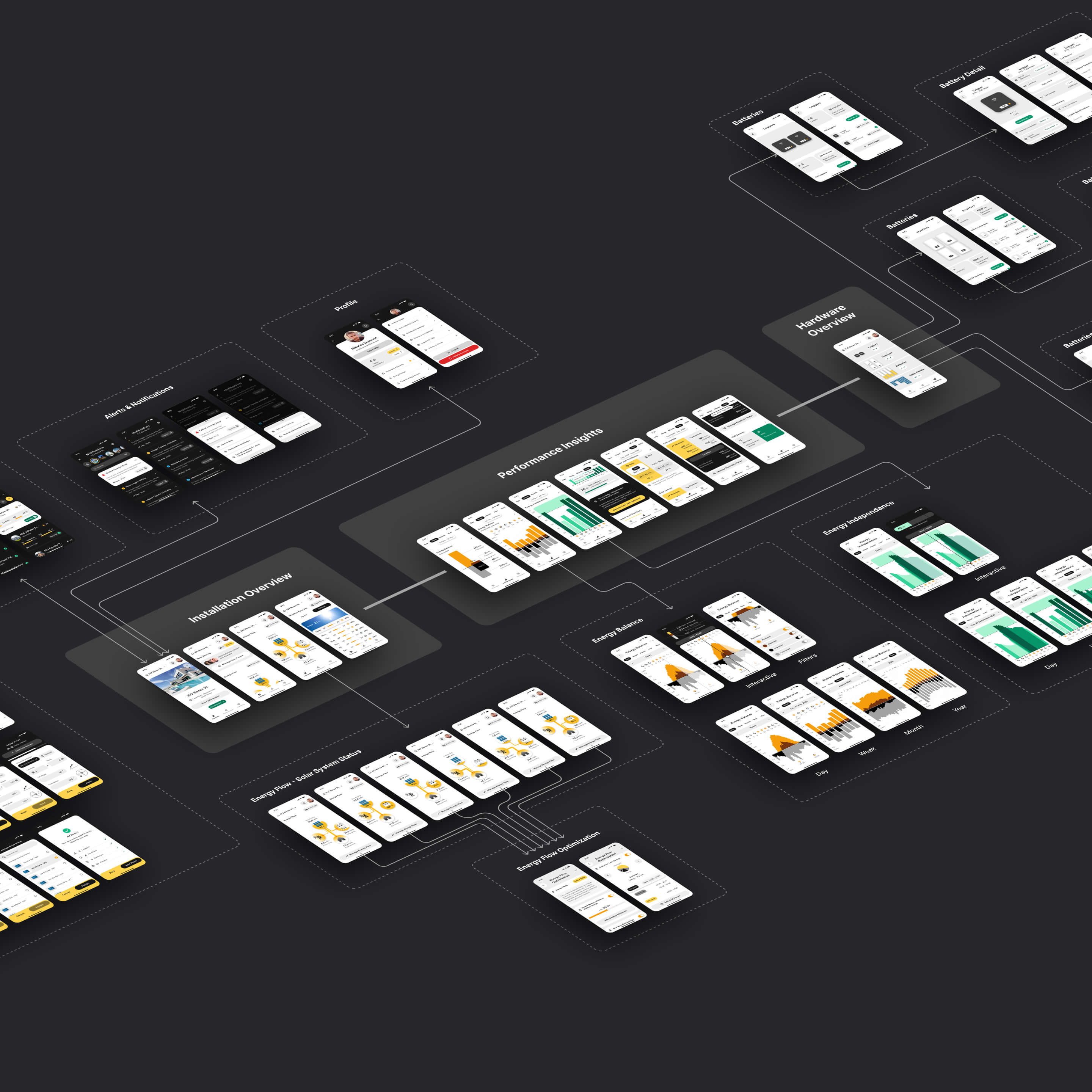
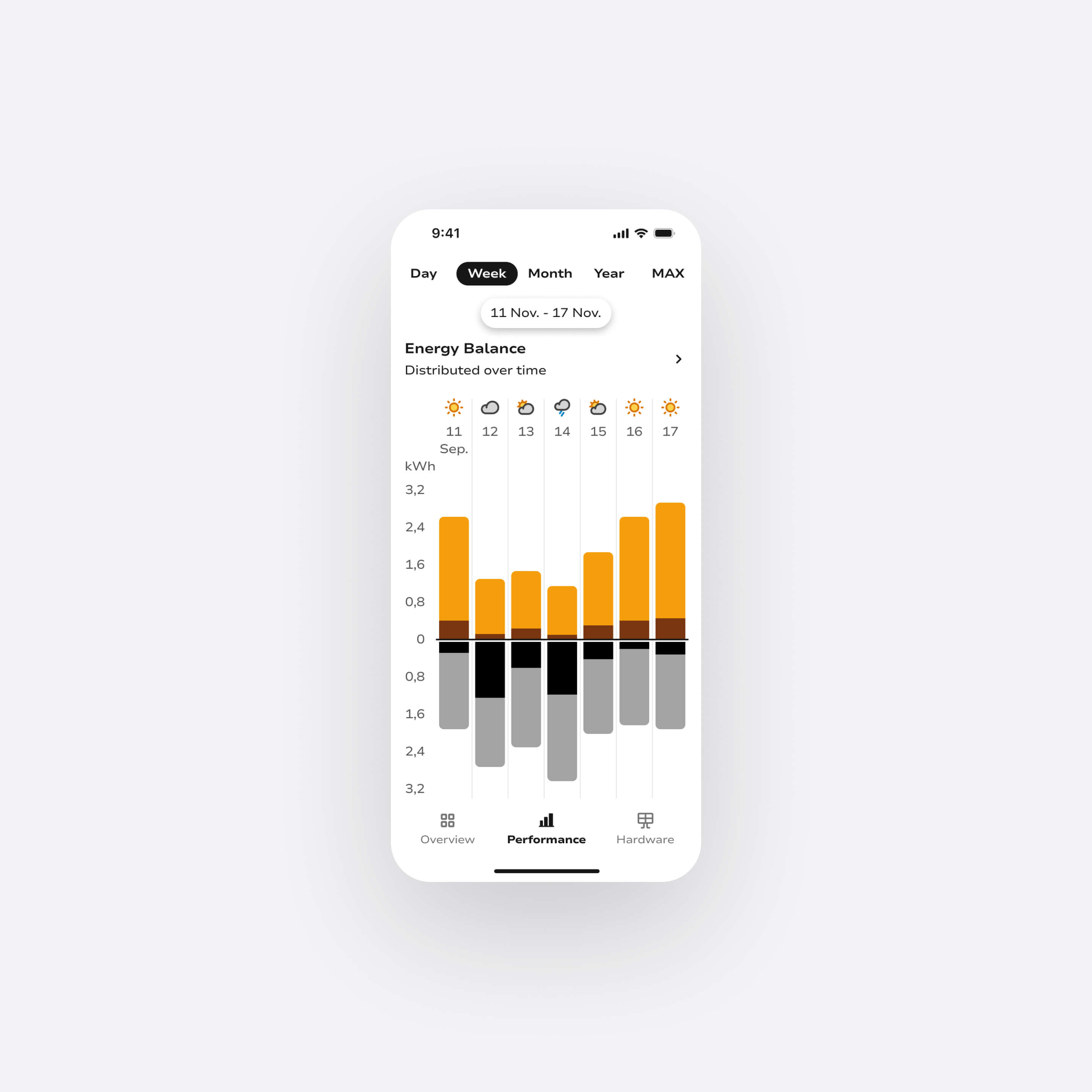
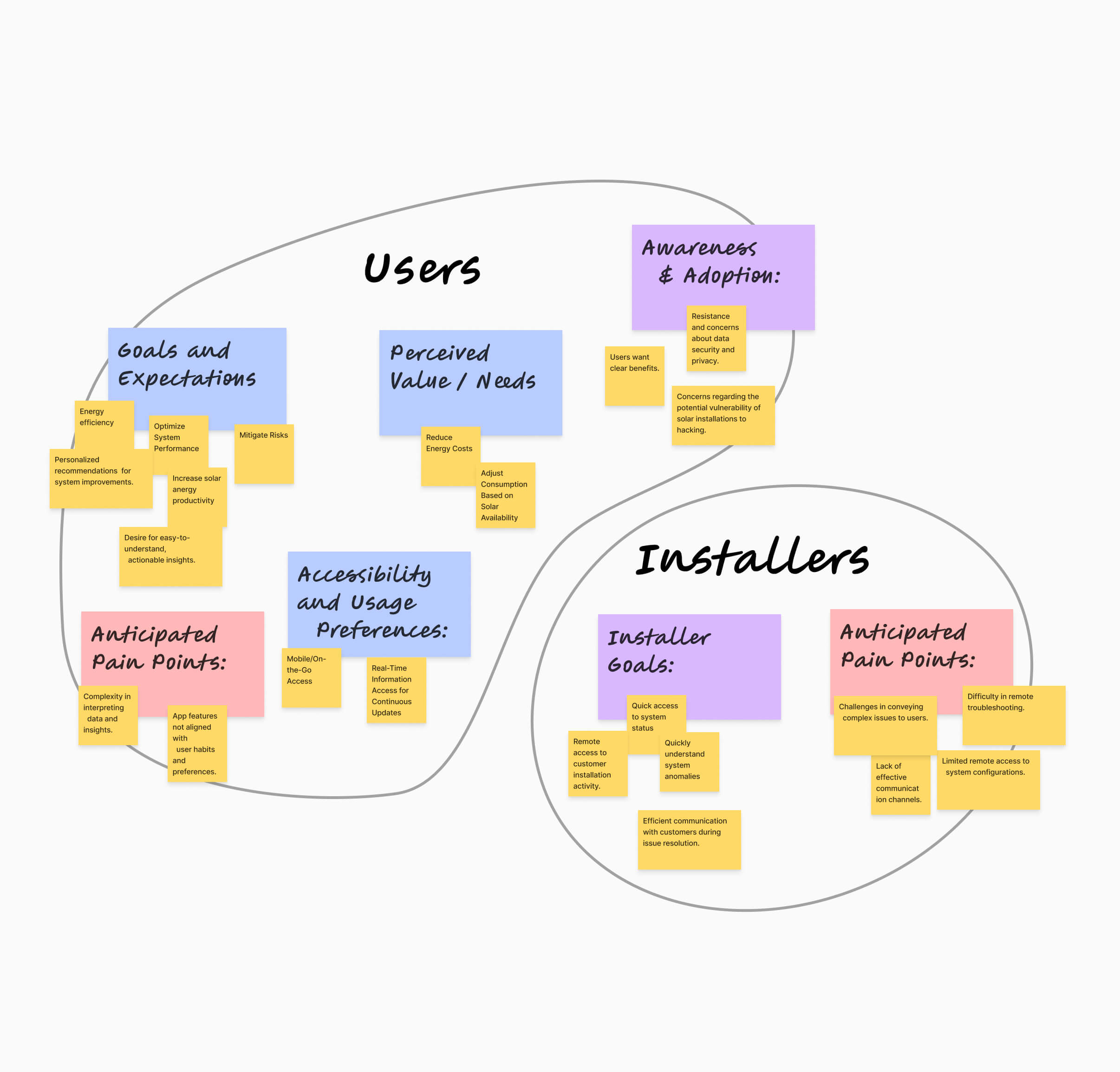
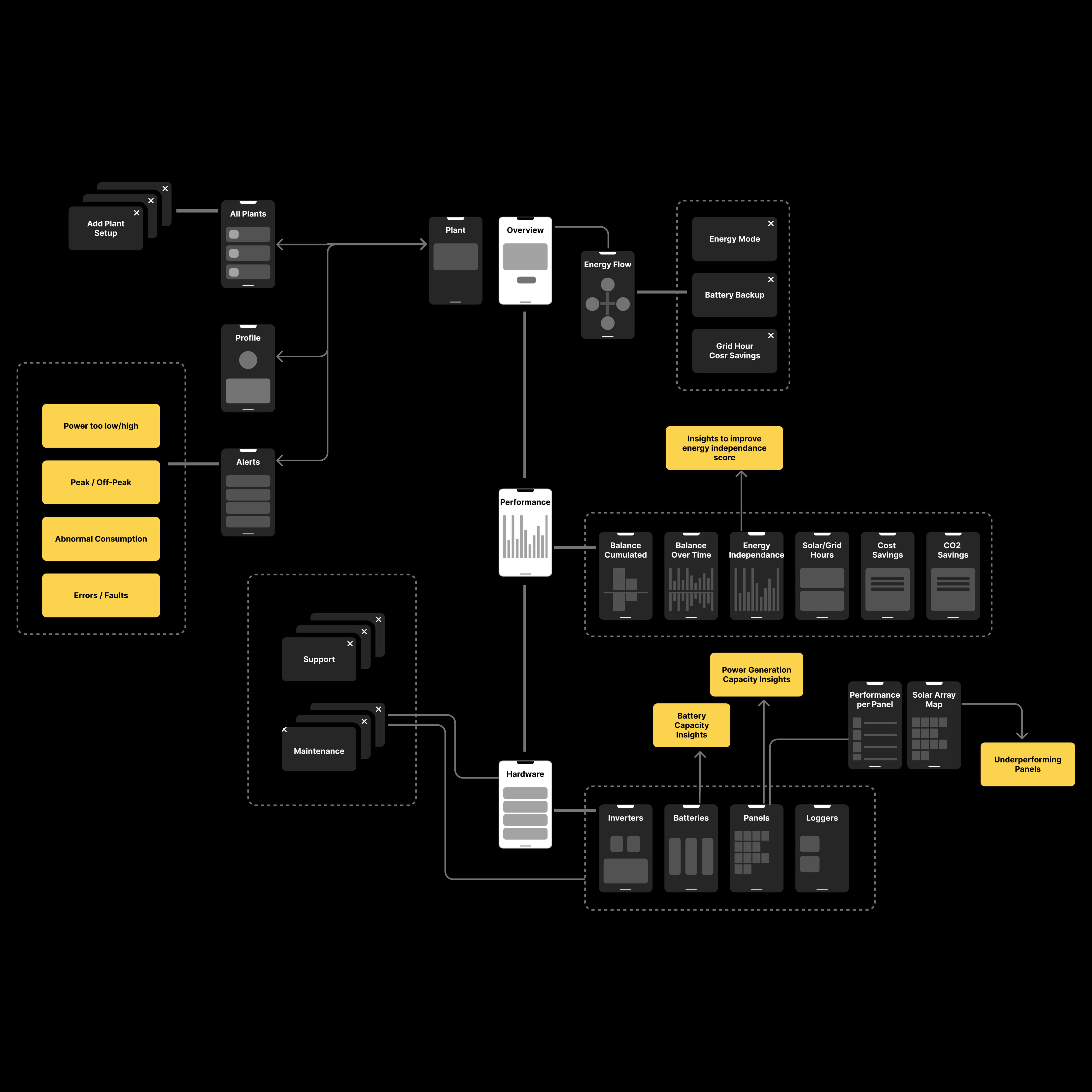
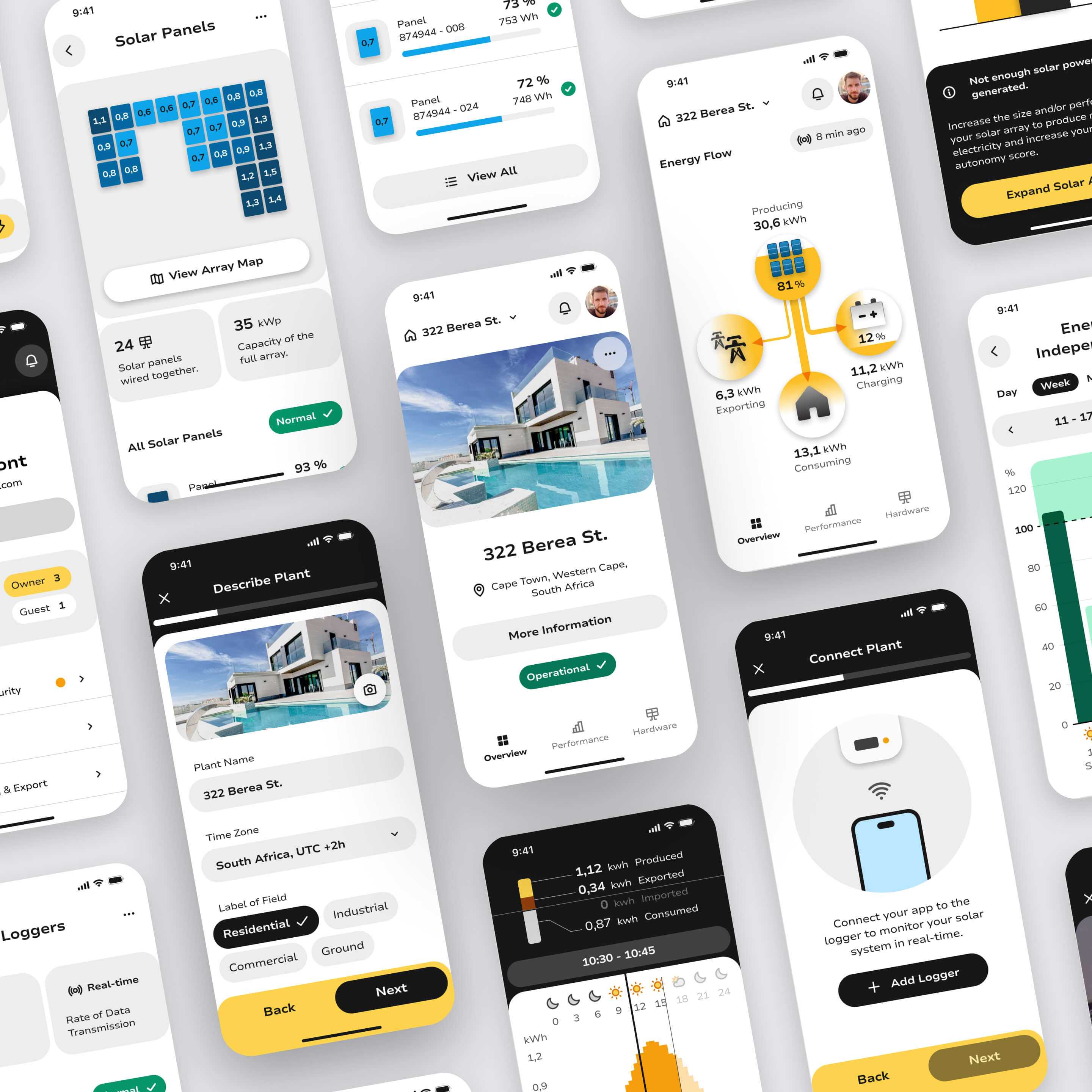
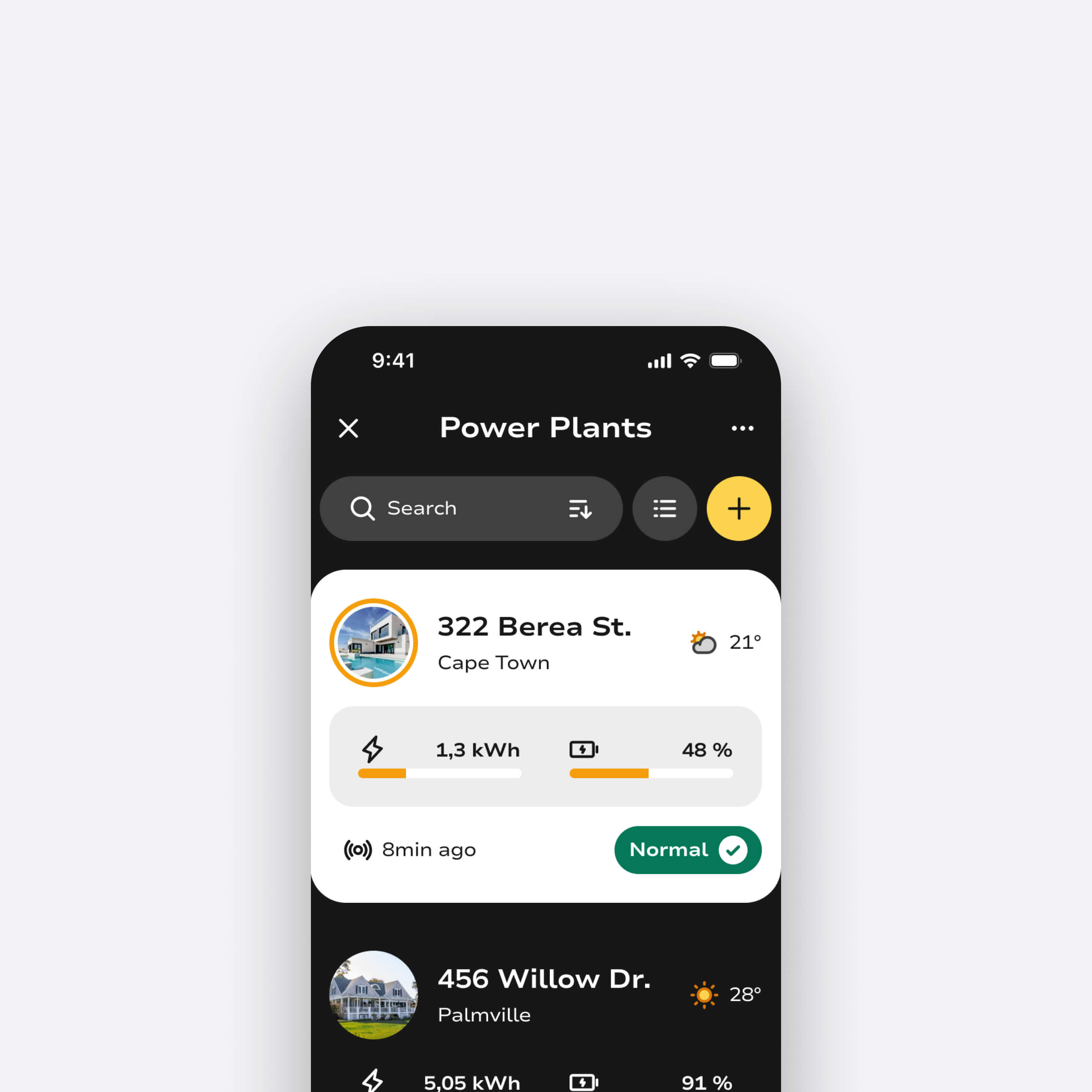
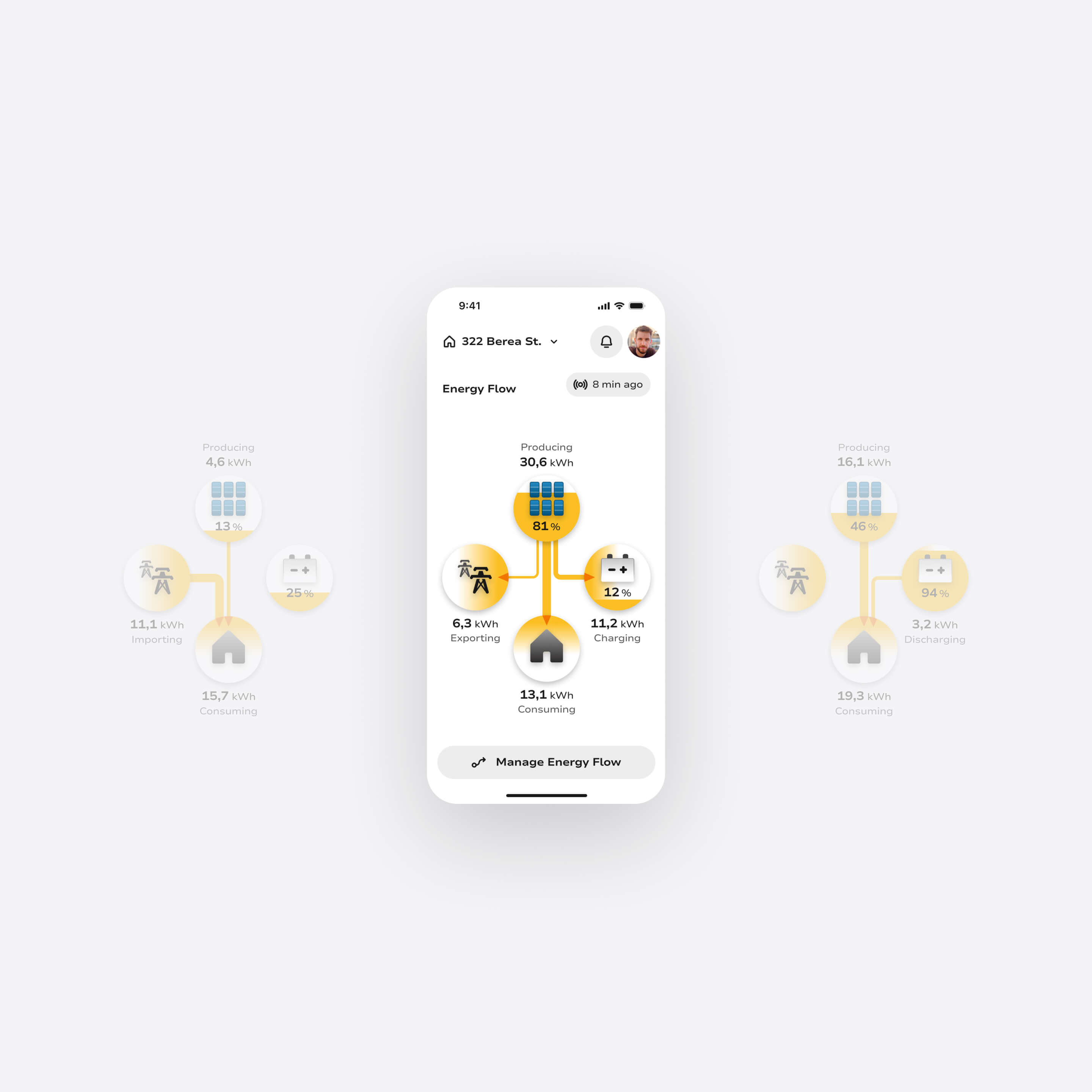
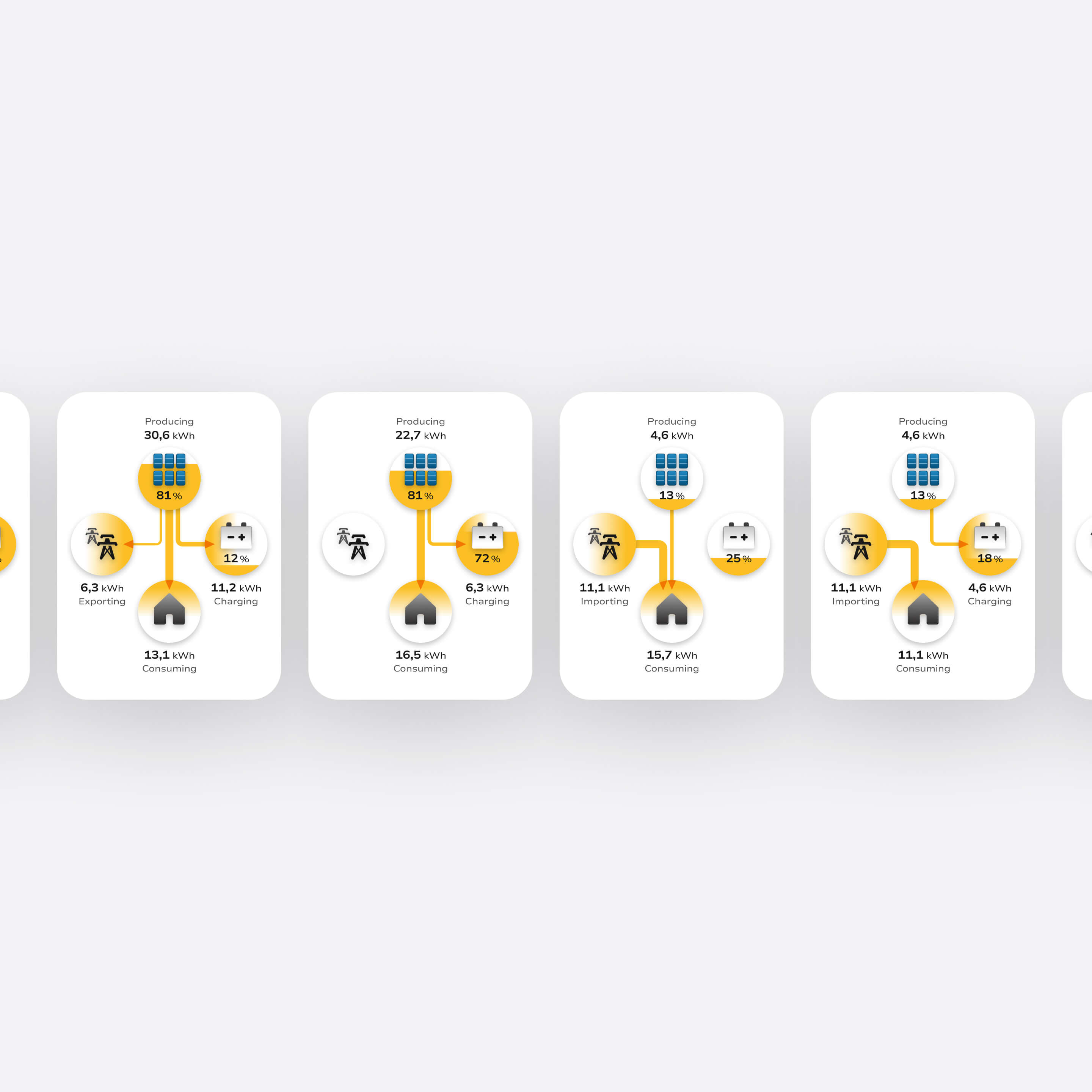
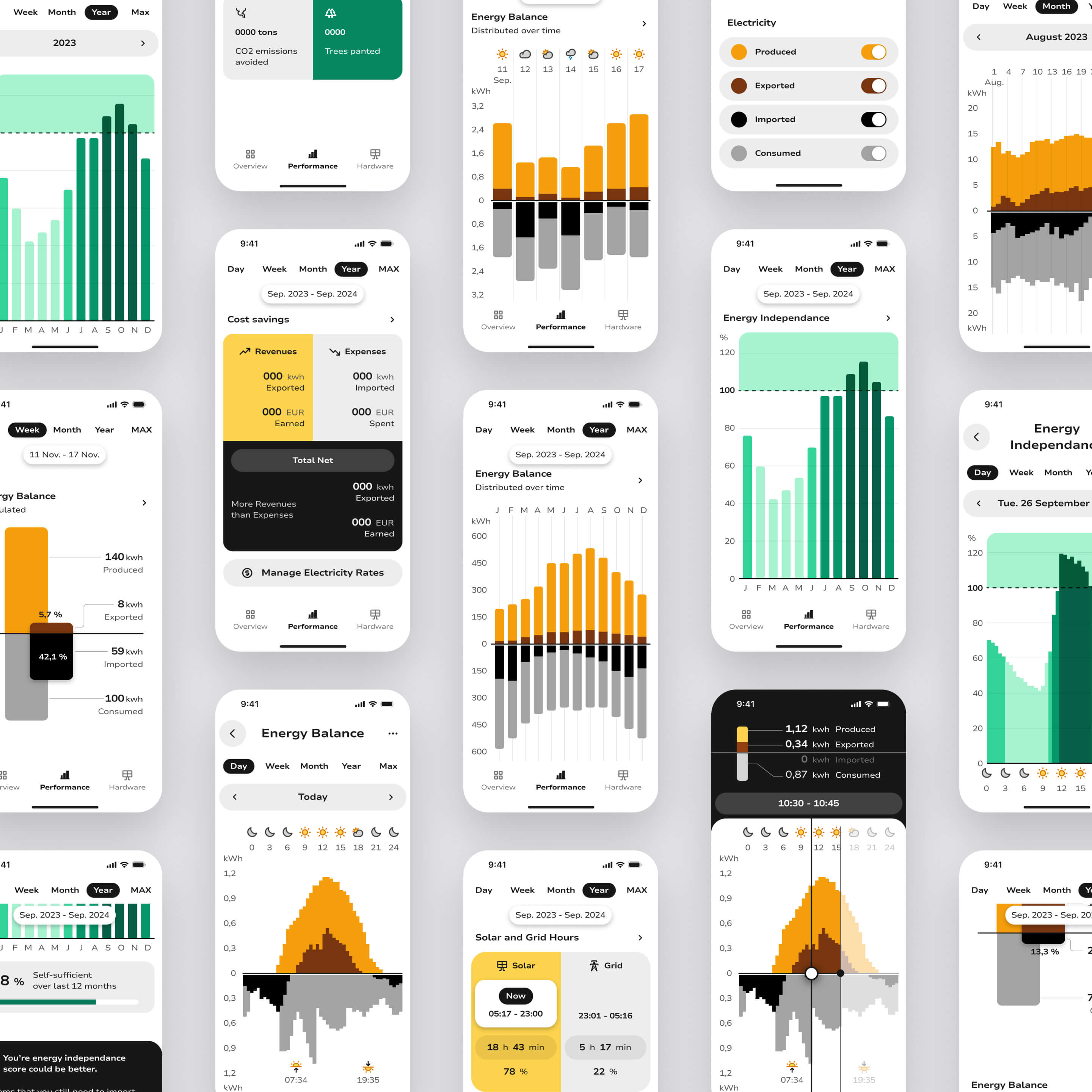
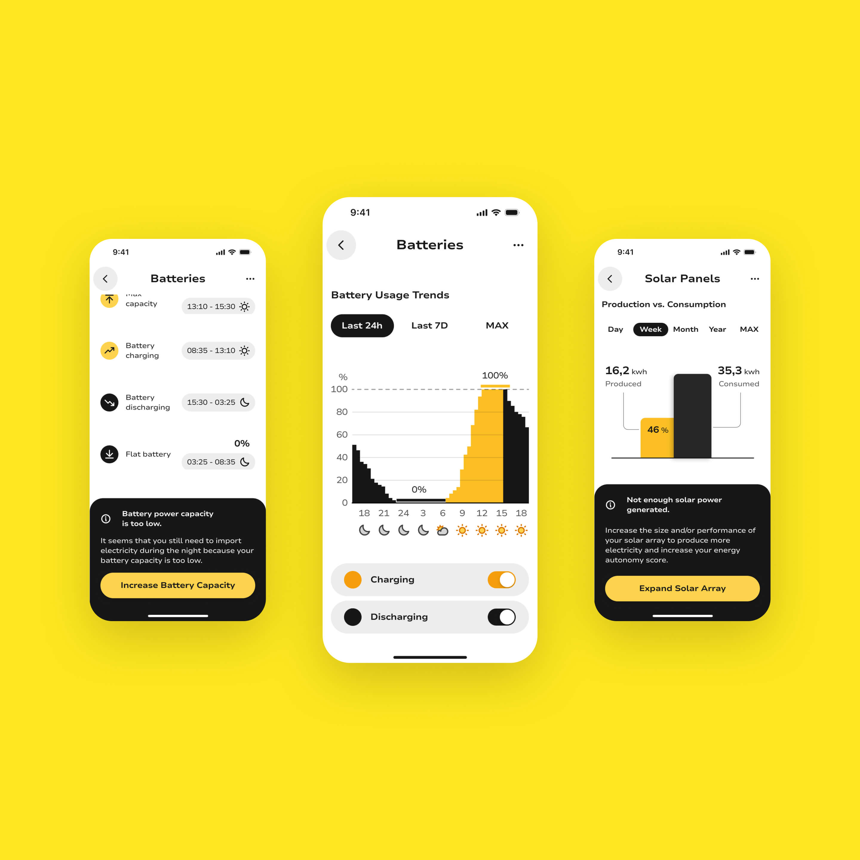
Designed a mobile-first solar performance monitoring app that transforms complex energy data into clear, actionable insights: helping homeowners understand system health, detect issues early, and optimize energy usage with confidence and reduce their costs.

Project Setup
Self-initiated project
Industry
Energy & Utilities
Date
2023
Timeline
3 months
Role
UX/UI Designer
Team
Solo designer
Platform
Mobile-first
Keywords
0→1
Energy Tech
Dashboard Design
Mobile UX
Data Visualization
Branding
System Optimization
Flowchart detailing all screens within the Pulsun mobile app ; organized by categories like Profile, Alerts & Notifications, Installation Overview, Performance Insights, Energy Flow - Solar System Status, Energy Flow Optimization, Hardware Overview, Batteries, Battery Detail, Energy Balance, and Energy Independence.
Problem

Data-rich, insight-poor solar monitoring

As solar adoption surged, monitoring apps failed to keep pace with user needs. Leading hardware manufacturers (SolarEdge, Enphase, SunPower) invested heavily in physical installations but shipped software with poor UX, reflected in consistently low app store ratings.

Apps prioritized raw production metrics over system understanding, leaving users unable to assess system health, interpret energy flows, or know what action to take when something went wrong. The result: frustration, disengagement, and significant untapped potential for energy savings.

Photo displaying solar panels on a vegetative roof.
Mobile view of Pulsun, featuring a chart providing insights about energy balance over time.
Photo by Moritz Kindler on Unsplash
UX Research

Where solar monitoring fails users

My goal was to identify why solar monitoring apps fail to support insight and action and where the real opportunity lies.

Interviews

I conducted interviews with solar system owners and installers to surface mental models and monitoring habits. I revealed a wide gap between what users wanted to know and what apps actually surfaced: most users couldn't confidently assess whether their system was performing well.
Affinity Diagram utilized for categorizing and sorting insights gathered from user and installer interviews.

Contextual observations

Documented a wide range of real-world solar installations to capture the diversity of system configurations, with particular focus on inverters as the core component users interact with most and understand least.
Existing solar installation, several inverters and batteries next to each other.
Existing solar installation, small inverter.
Existing solar installation, inverter.
Existing solar installation, logger.
Existing solar installation, batteries
Existing solar installation, inverter.
Diagram presenting a synthesized view of a solar system installation and its main components, including panels, batteries, inverter, grid connection, etc.
Custom Diagram created using isometric graphics by macrovector on Freepik, the diagram offers a comprehensive view of solar panel system components and their connections.

UX Audit & usability evaluation

Ran structured heuristic evaluations and usability tests with real users on Solarman (legacy) and Sunsynk Connect, grounding friction points in observed behavior rather than assumptions.
vUser flow of the existing Solarman (legacy) app, highlighting all user pain points identified on the screens and linked to app navigation, interaction modes, displayed information, and accessibility.
Photo capturing a person holding a phone and engaging with the Solarman (legacy) app during a rapid usability test for a UX audit.
Photo : Mobile content from Solarman Legacy App & integrated into the photo by charlesdeluvio on Unsplash

Competitive analysis and app store review analysis

Benchmarked leading solar apps (mySolarEdge, Enphase Enlighten, Solarman, Tesla, Sunsynk Connect) across UX maturity and feature coverage, and synthesized App Store and Google Play reviews at scale. Findings consistently reinforced that the market gap was user experience, not functionality.
Competitive analysis matrix utilized for comparing existing solar monitoring apps.
Compilation of reviews for existing solar monitoring apps in app stores.
Visual compilation of various existing solar monitoring apps with unfavorable ratings and negative reviews in app stores.
Visual crafted by integrating screenshots and logos from existing  solar products, including : CSI Cloud, JinkoSolar, Q.OMMAND Home, mySunRun (legacy), Solar.web, and SMA Energy Apps.
"I can see the numbers, but I don't know if my system is working well."
— Alex / Homeowner, non-technical solar user
"I only realize there's a problem when my electricity bill goes up."
— Marie / Small business owner, solar self-consumer
Key pain points

High cognitive load, low system visibility

Confusing performance metrics

Numbers were presented without context or benchmarks, making it impossible for users to know whether their system was performing well or poorly.

Poor energy flow visibility

Production, consumption, storage, and grid exchange were disconnected: users couldn't mentally model how energy was actually moving through their system.

Limited system health awareness

Hardware issues and inefficiencies were difficult to spot early, often only discovered when bills increased or output visibly dropped.

No optimization guidance

Apps reported on the past but never suggested what users should do next, leaving them passive observers rather than active managers.
UX Strategy

From passive monitoring to active energy system management

I reframed Pulsun from a data display tool into a system management experience. Rather than surfacing all available metrics equally, the strategy applied progressive disclosure to prioritize what users needed to see first (system health at a glance) then enabled deeper exploration only when relevant. Clarity, hierarchy, and actionable feedback were the three design principles that shaped every screen.

Detailed Information architecture of Pulsun app.
Users don't want more data. They want to know if their system is OK, and what to do if it isn't.
01

Clarify system health

Introduced a clear, high-level status layer (a single source of truth for whether the system is running well) before surfacing any detailed metrics.
02

Visualize energy flows

Designed intuitive diagrams and charts that show how energy moves between production, storage, consumption, and the grid, making abstract relationships tangible.
03

Guide user actions

Paired performance data with concrete recommendations, optimization controls, and alert-driven prompts so users always knew what step to take next.
Diverse mobile screens of the Pulsun app providing an overview of the overall visual design and app identity.
Iterations & Design Solutions

Designing a unified solar management experience

I designed a unified mobile experience for monitoring, understanding, and optimizing solar energy systems. I Designed and iterated on key product flows covering system status, energy patterns, performance insights, and optimization tools. Each iteration reduced cognitive load while increasing clarity and user confidence.

Pulsun mobile view with the list and overview of solar installations.
Pulsun app solar installation overview and homescreen.

User-friendly setup

Designed a guided onboarding flow that accommodates diverse hardware configurations (panels, inverters, batteries, loggers) with step-by-step compatibility handling and personalized setup paths.
Pulsun modal and various steps for setting up a solar installation within the app.

Hardware dashboard

Built a dedicated system status view giving users an at-a-glance overview of every component in their installation: with drill-down access to device-level stats, performance history, advanced controls, and direct support links.
Pulsun hardware dashboard presenting the status of all installed equipment in the solar system.
Diverse mobile views showcasing hardware details and status, including inverters, batteries, loggers, and solar panels.
Mobile view of the solar array map in the solar installation.

Energy flow visualization

Designed real-time and historical energy flow diagrams showing the relationship between solar production, battery storage, home consumption, and grid exchange: making the invisible, visible.
Smartphone screen showing an energy flow dashboard with energy production, exporting, charging, and consuming values in kWh and percentages.
Four energy flow diagrams showing kWh values for producing, charging, importing, exporting, and consuming in a solar power system.

Performance insights

Surfaced consumption patterns, generation forecasts, cost analysis, and energy independence scores through readable, contextualized data visualizations, giving users the understanding to act, not just observe.
Mobile view of Pulsun featuring informative data charts on solar energy balance and energy independence.
A set of smartphone screens displaying various energy management dashboards with charts showing energy balance, consumption, production, cost savings, and energy independence over different time periods in yellow, green, black, and gray colors.

Optimization tools

Enabled users to actively manage their system: controlling battery backup levels, switching between energy sources, scheduling consumption during off-peak hours, and receiving AI-driven suggestions to improve efficiency.
Comprehensive user controls for managing and optimizing the energy flow within the solar system, enhancing energy management and usage.
Mobile view featuring UI cards and charts providing users with informative insights about system performance and guidance on optimizing hardware for enhanced solar energy efficiency and usage.

Alerts & maintenance

Designed a smart notification system for anomalies, performance drops, and predictive maintenance reminders: enabling early detection and reducing the risk of unplanned failures.
Notification and smart alert system integrated in Pulsun app.

Design system

Built a clean grey-tone palette with bold black contrasts and an energizing orange accent, rounded components for approachability, and a custom illustration library representing solar hardware components, ensuring visual clarity and consistency across every screen.
Design system overview, showcasing the layout system and spacing utilized across all mobile screens.
Custom illustration crafted for the Pulsun app, featuring depictions of key solar system hardware components, including batteries, inverters, loggers, and solar panels.
Pulsun Design System and Style Guide.
Expected Impact

Improving energy awareness, optimization, and user confidence

50%
faster for users to detect system issues and optimize energy flows
65%
adoption of optimization features within first month of use
40%
reduction in energy waste via actionable recommendations
80%
of users report improved confidence managing solar systems independently

Cost reduction

Lower energy bills through consumption management tools, off-peak scheduling, and personalized efficiency recommendations.

Energy optimization

Maximized solar self-consumption and reduced grid dependency through intelligent energy flow controls and production insights.

Fewer undetected issues

Earlier identification of hardware anomalies and performance drops through smart alerts and predictive maintenance, reducing the risk of costly failures.

System clarity & smarter data reading

Faster understanding of system health and better interpretation of energy flows and performance trends through clear visual indicators, a status-first hierarchy, and contextual data visualization.

Proactive management & user autonomy

Increased ability to act early through actionable insights and smart alerts, building the confidence to manage solar systems independently without relying on installers or support.
Diverse mobile screens from the Pulsun app showcasing the energy production performance of the solar array and individual panels.
Takeaway

Enabling smarter solar decision making

Pulsun started from a clear market failure: hardware-first companies shipping software that users couldn't navigate or trust. By reframing the product around system management rather than data display (and grounding every design decision in how users actually think about energy) the result is a monitoring experience that respects both the complexity of the domain and the limits of user attention.

The project reinforced a core belief: in data-heavy products, the designer's job is not to show everything. It's to surface what matters, explain what it means, and make the next action obvious.

Disclaimer

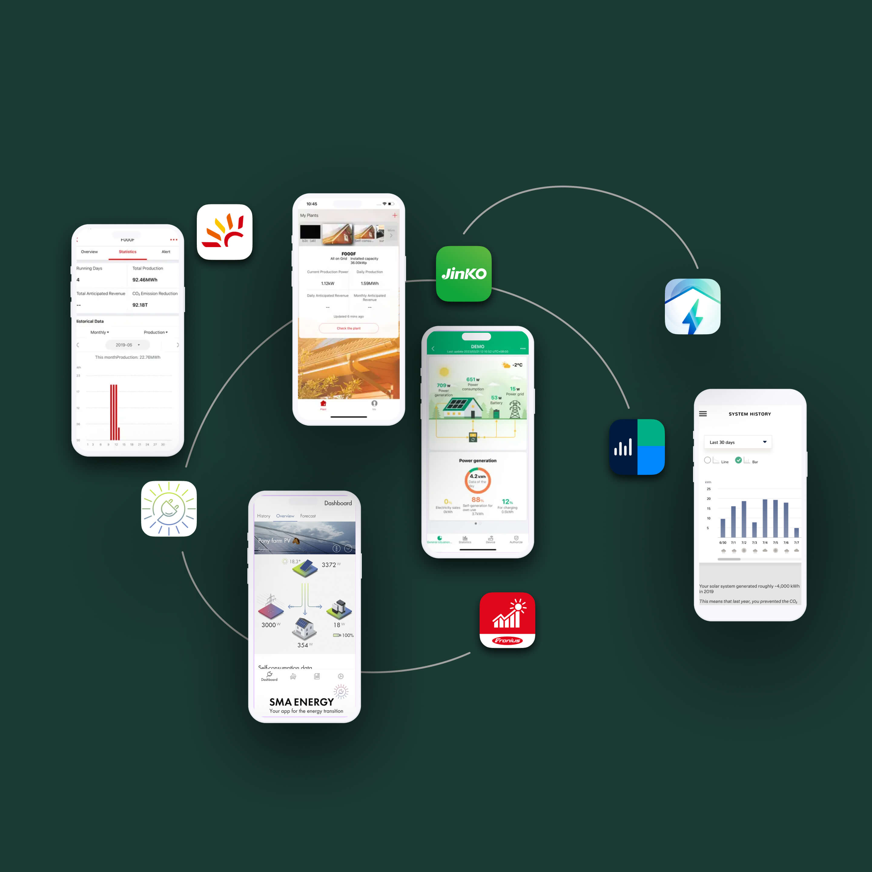
This is a self-initiated concept project. Pulsun is not affiliated with any existing solar hardware manufacturer or commercial platform. All content, screens, and data have been created for portfolio purposes to explore real UX challenges in the solar energy monitoring space.

Any quantitative metrics presented reflect typical outcomes that could be expected from such a concept, but they are not based on real-world field data or validated measurements. They are illustrative in nature. I recognize that measuring UX impact is a critical step in any UX project, and that proper validation is essential to assess whether design decisions effectively move the user experience in the right direction.

Two smartphones displaying a power plant monitoring app with energy production and consumption charts.
Screenshot of HAL open access platform homepage highlighting long-term archiving, growing visibility, valued work, and multidisciplinary space, with a sample research article displayed below.