HAL Open Science

Revamping France’s leading open science platform

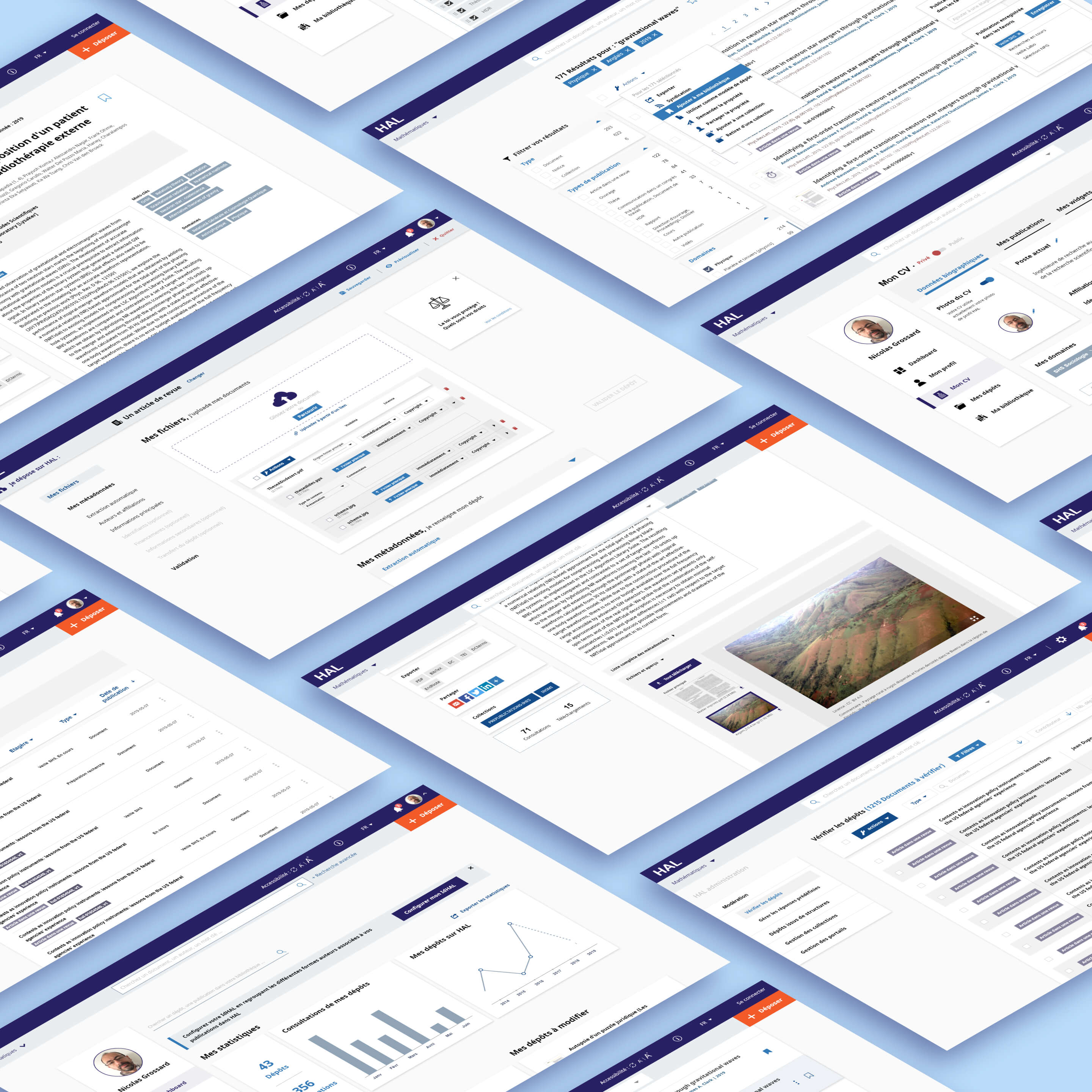
As lead UX/UI designer at L'Atelier Universel, I led the full redesign of HAL, the French national open archive serving researchers, institutions, and academic administrators across all scientific disciplines.

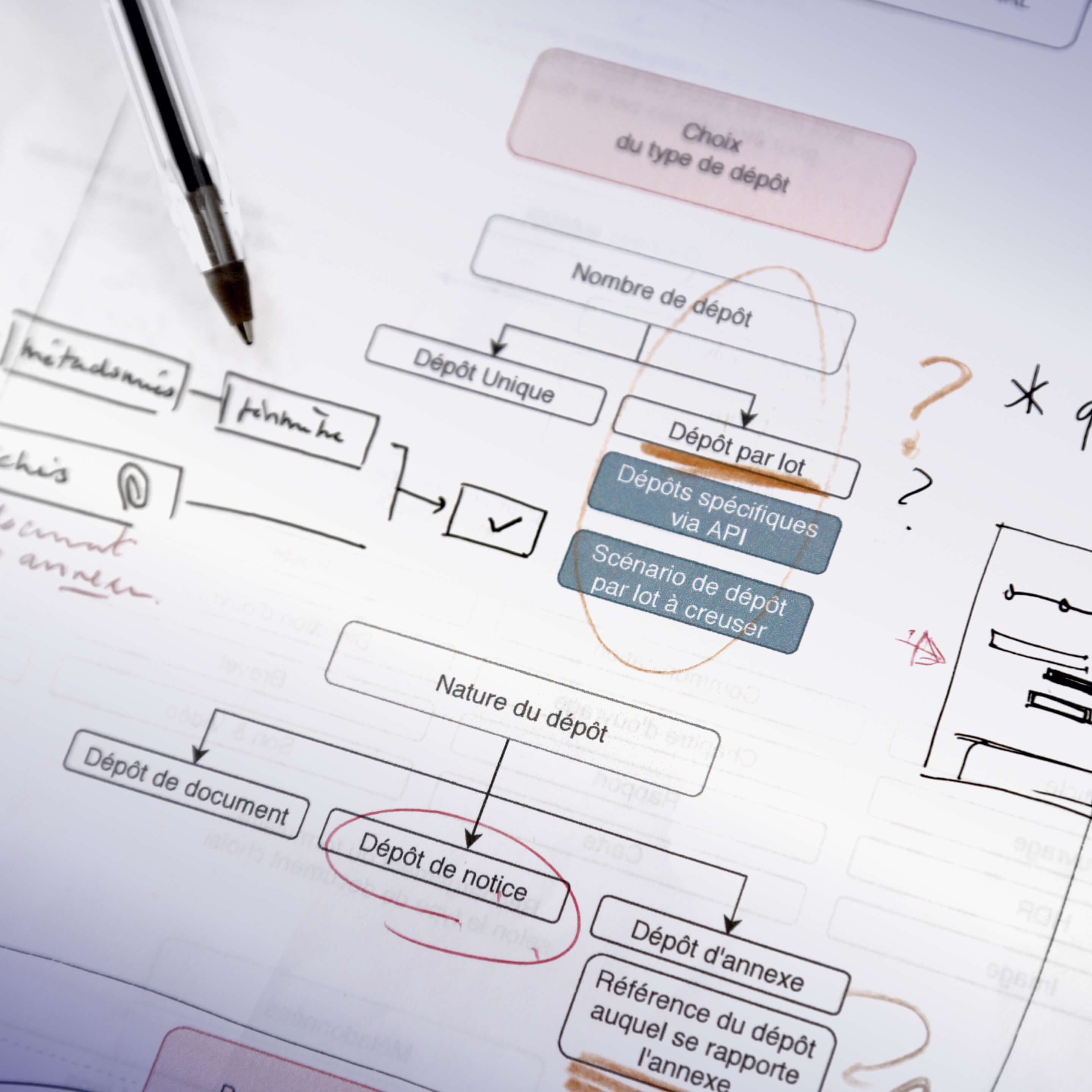
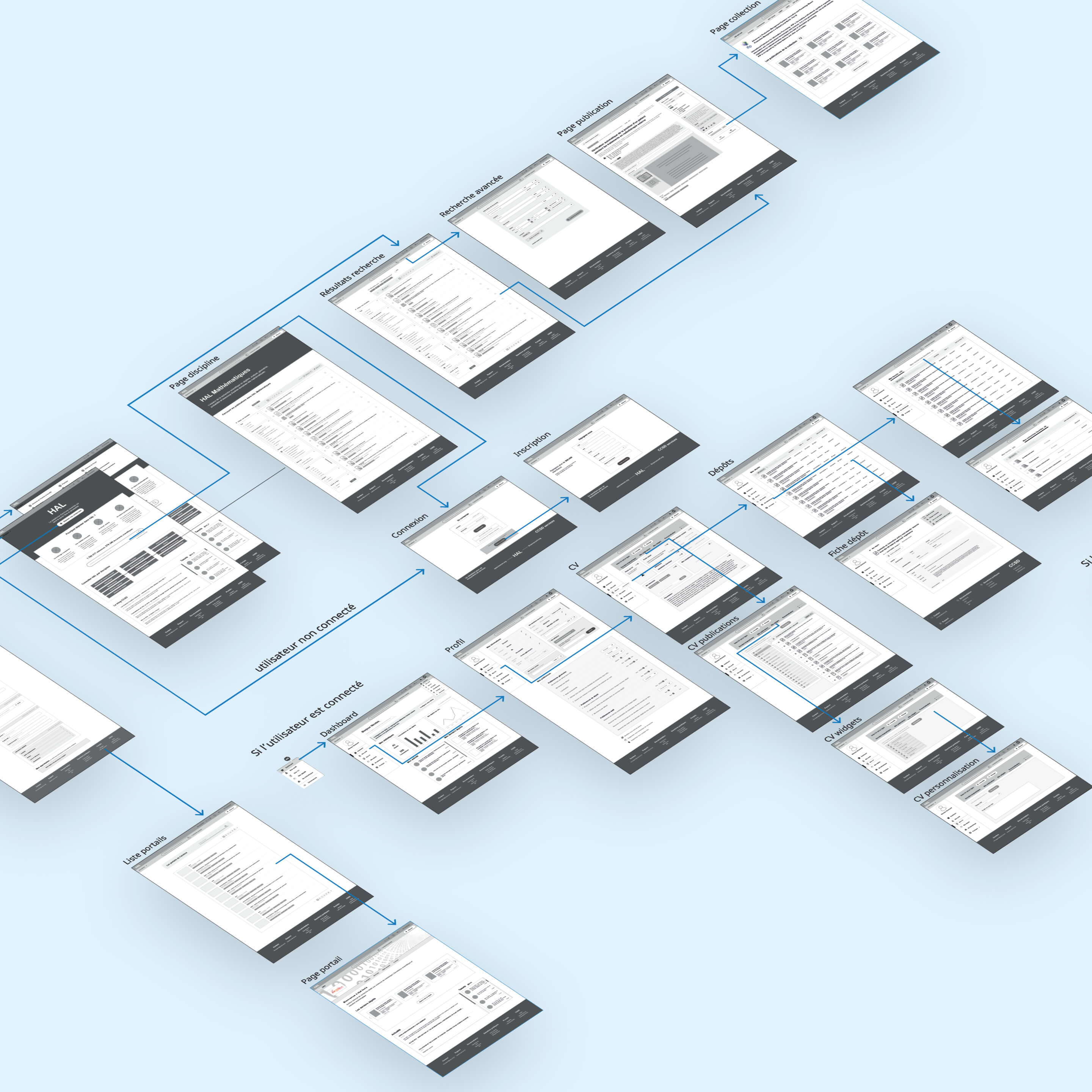
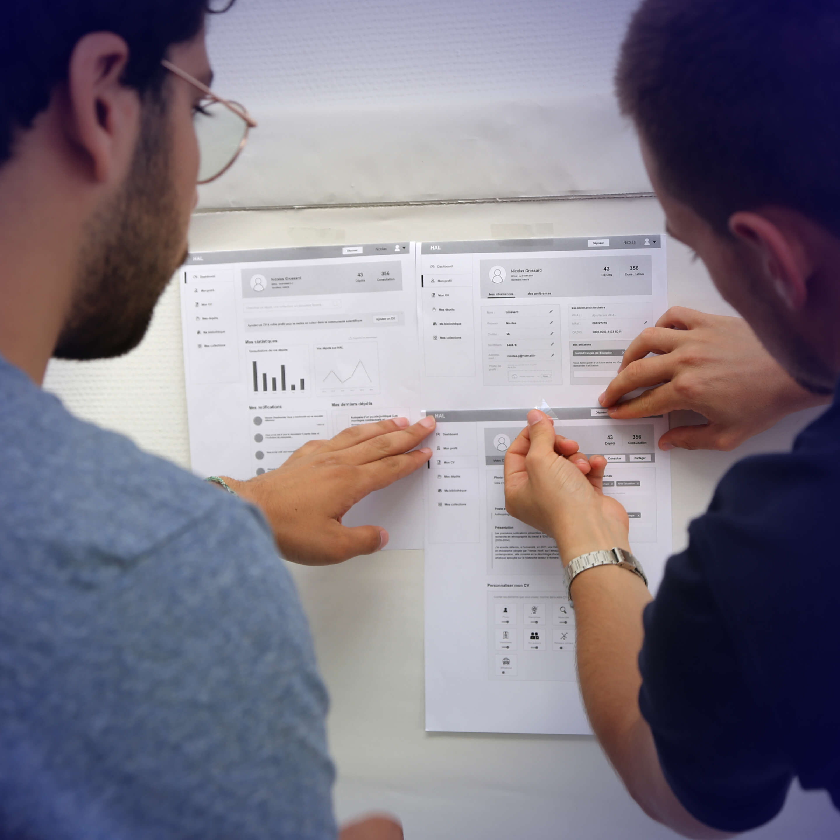
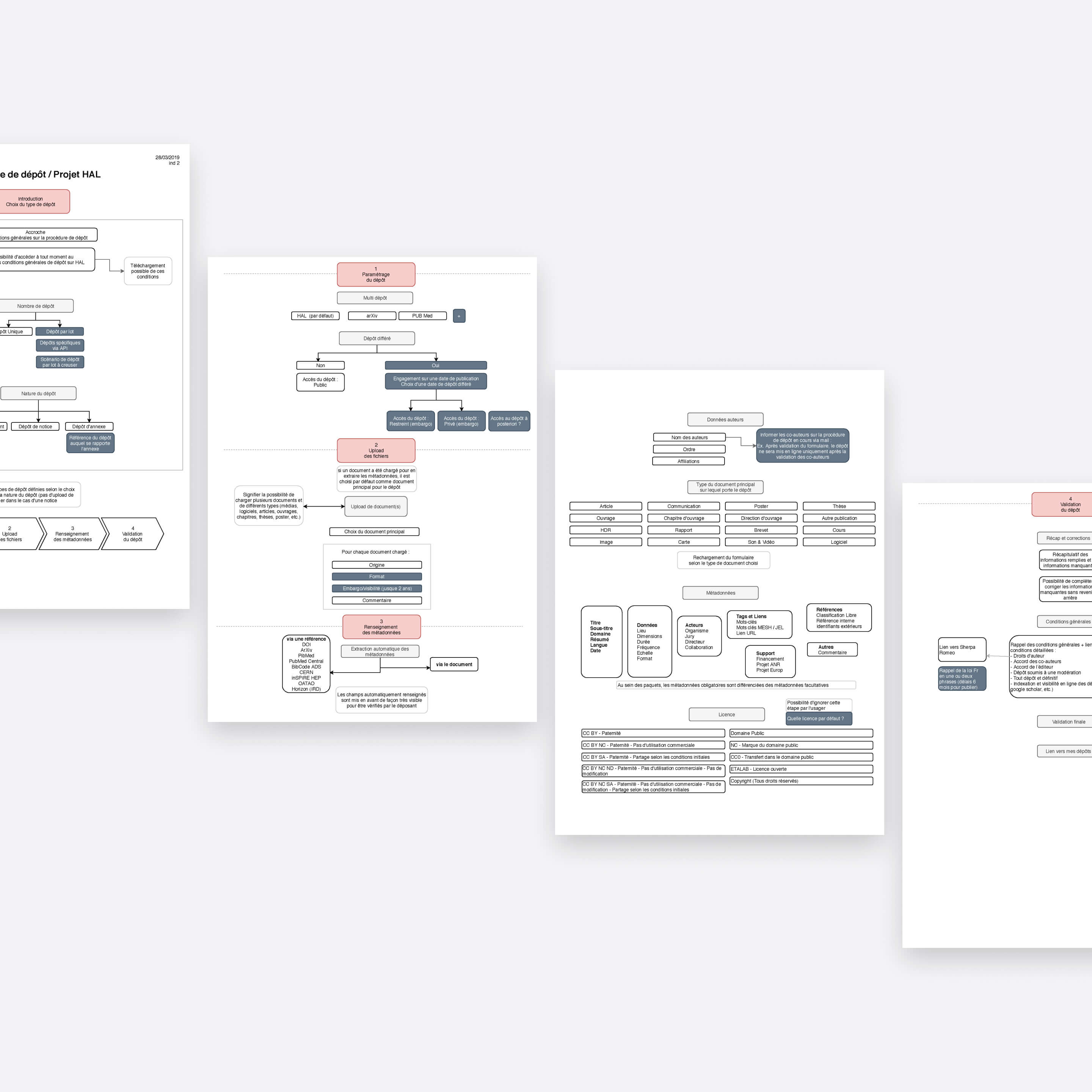
Over 16 months, I conducted in-depth user research, heuristic audits, usability testing, and a complete overhaul of the platform's information architecture, submission flows, and visual identity.

he redesign delivered measurable impact at scale: more deposits, more active researchers, fewer support requests.

Shipped in 2021
Client
CCSD / CNRS
Industry
Education & Research
Date
2019
Timeline
16 months
Role
Lead UX/UI Designer
Team
Design consultancy at L'Atelier Universel, cross-functional client team
Platform
Web (Open Science Platform)
Keywords
Open Science
Enterprise UX
B2B
Information Architecture
Form Design
Public Sector
Research Platform
Overview of the HAL redesign. Multiple overlapping screenshots of an academic research platform showing user profiles, document uploads, search results, statistics, and metadata editing.
Problem

UX friction limiting platform growth on France's national research infrastructure

HAL is France's primary open archive for scientific publications, maintained by the CNRS and used by researchers across every academic discipline. Despite its institutional importance, the platform struggled to convert awareness into contribution.

Fragmented access points across dozens of university portals, an opaque submission flow, and a dated interface undermined trust and discouraged engagement. Researchers who wanted to deposit their work often could not find where to start. Those who found the form frequently abandoned it. The platform's reach was limited not by its mission, but by its usability.

Diagram map illustrating the complexity of HAL's ecosystems and various web portals at the time of my project involvement.
Photo illustrating researchers studying and collaborating within an academic environment. / Photo by Mimi Thian on Unsplash.
HAL exhibits a complex digital ecosystem with access points through partner university portals and collections associated with distinct research projects. (Photo by Mimi Thian on Unsplash).
UX Research

Uncovering barriers to researcher contribution

Identifying what prevent researchers from submitting content and navigating the platform efficiently

Photo documenting a workshop activity using post-its to gather participants' perspectives on the existing HAL platform.

User workshops and focus groups

Conducted in-depth sessions with researchers to surface motivations, expectations, and frustrations. Key themes emerged around HAL's perceived complexity, its old-fashioned image despite strong brand recognition in academia, and a widespread underestimation of the benefits of depositing work on the platform.

Heuristic evaluation

Ran a structured UX audit across the full platform, with particular focus on navigation patterns, submission entry points, and information hierarchy. Identified systemic issues in discoverability, labelling, and form logic that created friction at every step of the researcher journey.
Audit of HAL's upload form with identified user pain points highlighted in red.
Photo capturing a flowchart focused on optimizing the submission form.

Usability testing

Tested key researcher tasks on the existing platform, focusing on finding and completing the deposit flow. Sessions confirmed that the upload form was both hard to locate and difficult to complete, with multiple drop-off points driven by unclear instructions and unnecessary complexity.
Photo presenting a usability testing session of HAL's preexisting platform on a laptop.
"I know HAL exists and I know I should be depositing my papers there. But every time I try, I end up lost or giving up halfway through the form."
— Thomas / University researcher, social sciences
"My CV on HAL is empty. I never understood how to set it up and nobody showed me."
— Isabelle / Research engineer, CNRS laboratory
Key pain points

Submission friction and navigation breakdown

Confusing entry points

Dozens of discipline-specific portals and university sub-sites created a fragmented ecosystem with no clear central access point, leaving users unsure where the real platform began.

Invisible submission flow

The deposit form was buried within the navigation, with no prominent call to action and no clear path for first-time contributors to find or understand the process.

High form abandonment

The upload process was long, technically complex, and offered no progressive structure. Users did not know how many steps remained or what was expected of them, leading to frequent drop-off.

Undervalued platform benefits

Researchers did not clearly understand what depositing on HAL offered them in terms of visibility, citation, and open access compliance, removing any intrinsic motivation to contribute.

Neglected researcher profiles

The CV and publication profile feature was underused and poorly presented, offering researchers little reason to invest in their presence on the platform.
UX Strategy

From fragmented archive to researcher-centred contribution platform

Framed the redesign around three moments in the researcher journey:

  • Before the upload: building trust and surfacing value
  • During the deposit: reducing friction and building confidence step by step
  • After submission: rewarding contribution with visibility and recognition.

This structure gave the team a clear north star for every design decision and ensured that UX improvements addressed the full journey rather than just the form itself.

Diagram illustrating the complexity of HAL's ecosystem, featuring various websites (portals per university, researchers' project collections) that provide diverse and potentially confusing access to the same comprehensive database.
01

Unified navigation and IA

Consolidated HAL's fragmented ecosystem of portals and discipline-specific sub-sites into a single, coherent information architecture. Centralized discipline access directly from the main platform, eliminating the confusion created by parallel entry points.
02

Clear submission journey

Made depositing content immediately discoverable through a prominent, persistent call to action in the header. Redesigned the upload form with progressive disclosure, simplified steps, and contextual guidance to reduce abandonment and build user confidence throughout.
03

Researcher empowerment

Strengthened the online CV and publication profile feature to give researchers a compelling reason to engage with the platform beyond a single deposit, fostering ongoing participation and academic visibility.
Person holding a flowchart in front of a computer screen displaying the HAL open archive website.
Iterations & Design Solutions

Redesigning navigation, submission flows, and researcher visibility end to end

Led the full redesign from early UX audit through to final UI and developer handoff, covering platform architecture, homepage, navigation, deposit form, visual identity, and researcher profiles. Worked iteratively with the CCSD and CNRS client team, running multiple rounds of prototyping and validation across 16 months. The redesign touched every layer of the researcher’s experience.

Ecosystem simplification and IA overhaul

Restructured HAL's complex multi-portal ecosystem into a unified information architecture, integrating university portals and research collections under a single navigable platform.
HAL new information architecture overview.

Centralized discipline access

Prior to HAL's revamp, disciplines like social sciences were siloed in separate portals, fragmenting the user experience. The architectural overhaul centralized access to all academic fields directly within the main platform, resulting in streamlined navigation, simplified discovery, and a cohesive, integrated experience across disciplines.
Detailed view of the desktop menu allowing users to browse the HAL database based on scientific disciplines.
Photo showing me and a colleague engaged in prototyping the new HAL platform with wireframes.

Unified header and prominent submission CTA

Simplified the global navigation to surface clear, consistent access to both browsing and submission. Introduced a persistent, visible deposit call to action that reduced the discovery friction identified as the primary early-journey barrier.
HAL header before (bottom) and after (top) redesign.

Redesigned upload form

Mapped the full deposit flow with a detailed flowchart before rebuilding it with progressive disclosure, clear step indicators, and simplified field logic. Retained necessary complexity for academic accuracy while removing all avoidable friction that drove abandonment.
Flowchart utilized to map the steps and fields of the upload form during the redesign phase.
View of the upload form before and after redesign.
Upload form before and after redesign.
Screenshot showcasing various steps within the upload form modal in HAL.

Homepage redesign

Transformed the HAL homepage from a dense, text-heavy archive landing page into a clear, credible entry point that communicates the platform's value, guides users toward their primary action, and reflects HAL's institutional authority.
Snapshot of the redesigned HAL homepage and detailed document view.
Overview of HAL's visual identity and design system.

Visual identity and UI refresh

Contributed to a comprehensive visual redesign that modernised HAL's interface while preserving and strengthening its institutional character. The updated design system improved readability, trust, and consistency across the platform.

Enhanced researcher CV and profile

Redesigned the online publication profile and CV feature to offer researchers a more attractive, functional, and visible showcase of their academic output, encouraging ongoing engagement and fostering collaboration opportunities.
Desktop view of HAL's new CV/Resume feature, designed to showcase researchers' profiles, scientific work, and publication history.
Impact

Driving adoption through UX simplification, measurable results at national scale

The revamped platform was successfully shipped in 2021 and is live at hal.science.

Shipped in 2021
+45%
document deposits in the first six months post-redesign
+18%
active researcher accounts engaging with the platform
70%
reduction in navigation-related support requests

Increased researcher visibility

through redesigned CVs and publication profiles, strengthening HAL's role as an academic identity platform alongside its archive function
Comparison of HAL's landing page before and after the redesign.
HAL homepage before (left) and after (right) revamp.
Takeaway

Unlocking open science through UX design

By restructuring the information architecture and redefining core submission journeys, I repositioned HAL from a fragmented archive into a cohesive, researcher centric contribution platform. This shift reduced systemic friction, increased participation, and strengthened the platform’s capacity to scale as a national open science infrastructure.

Photo capturing a man using the redesigned HAL platform on a laptop.
Hand holding a phone showing the home screen of ADMR customer area.